

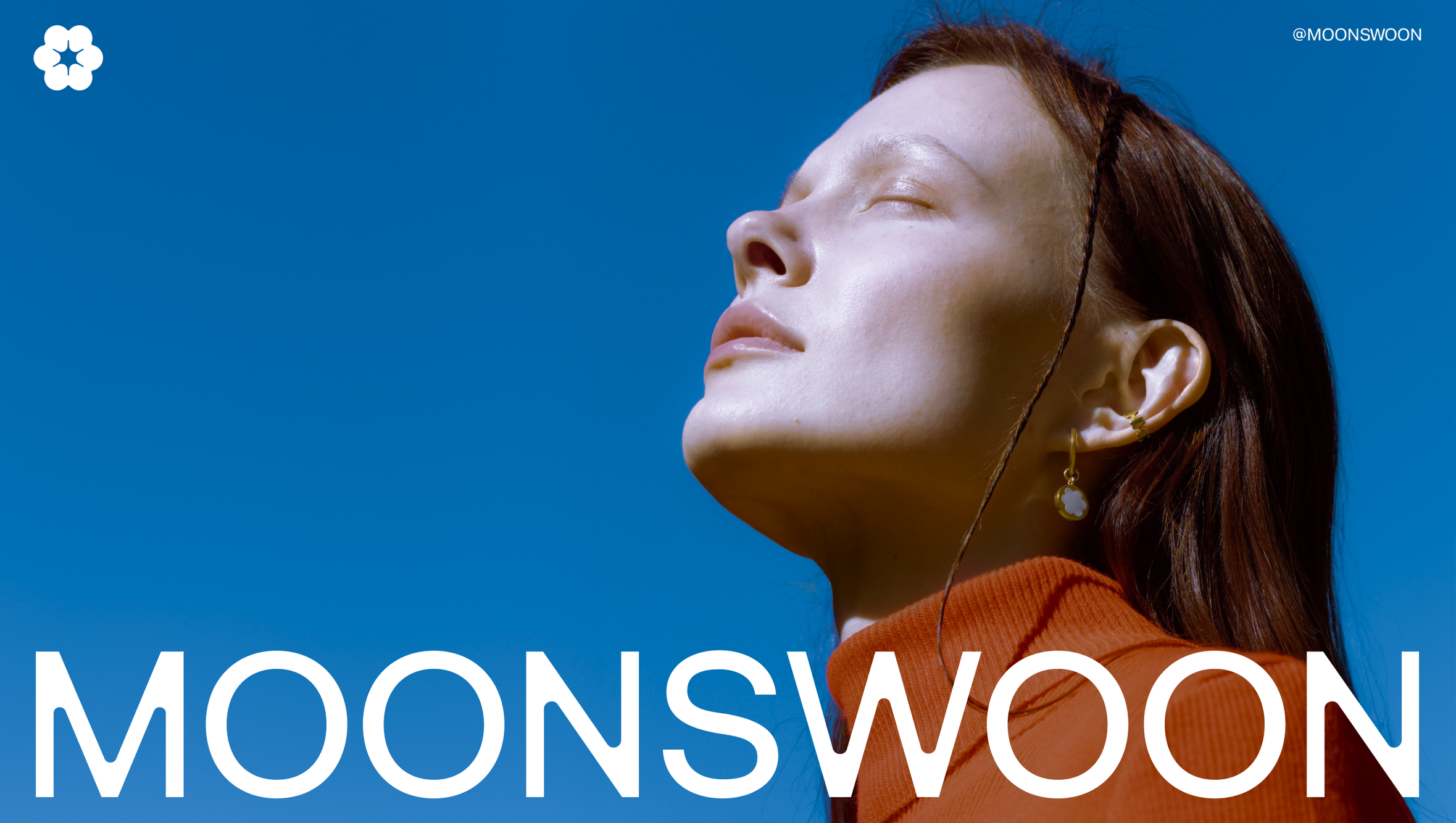
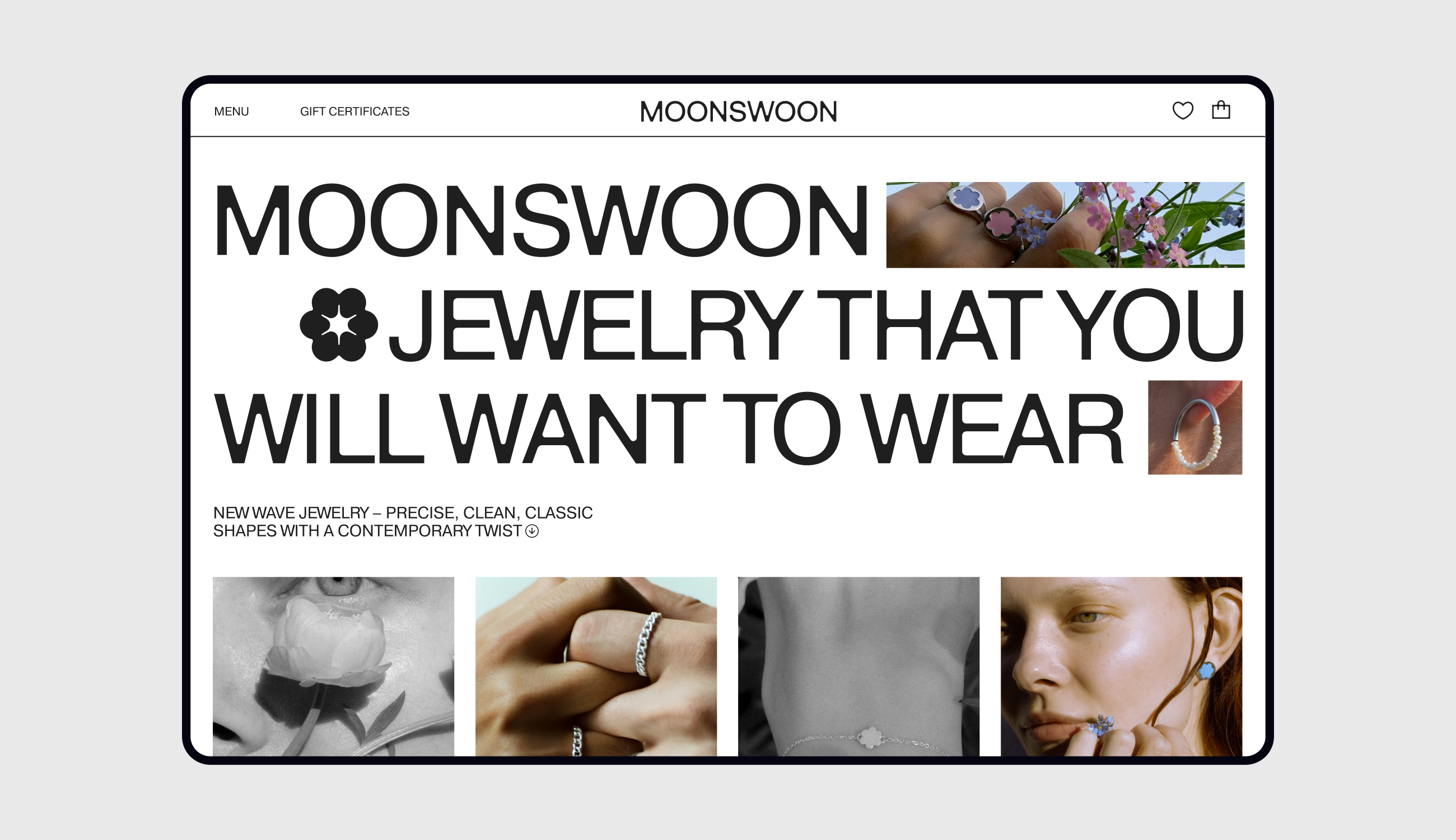
Moonswoon is a new wave jewelry brand with its origins in the Ural Mountains, radiating minimalist magic. Rooted in natural and mountain-inspired themes, the brand has already made its mark in Eastern Europe. Under my creative direction the rebranding has unveiled a fresh symbol, typography, a bespoke custom-design typeface, and brand graphics. This new visual identity captures a captivating narrative, highlighting the often overlooked details.
Symbol
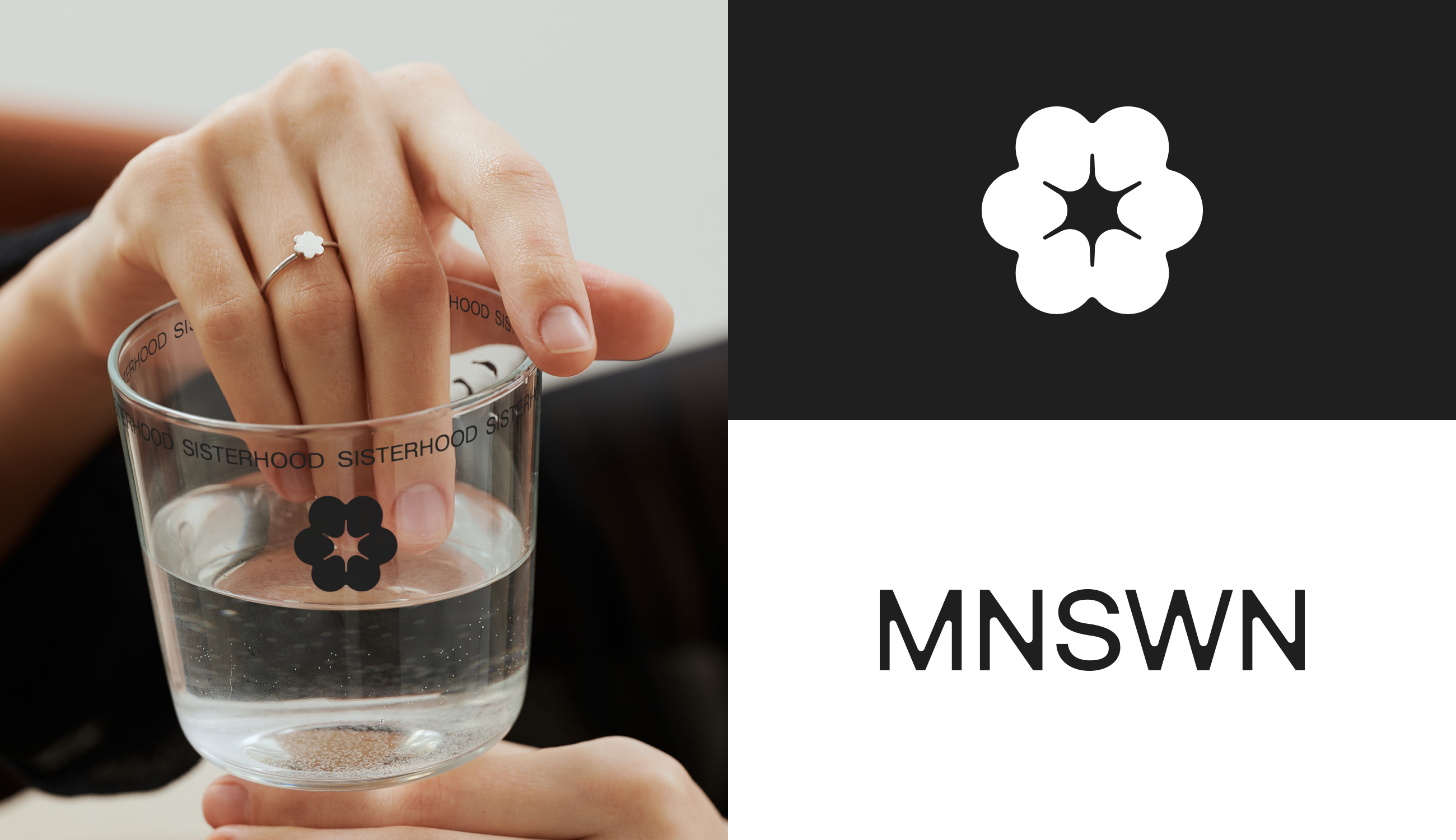
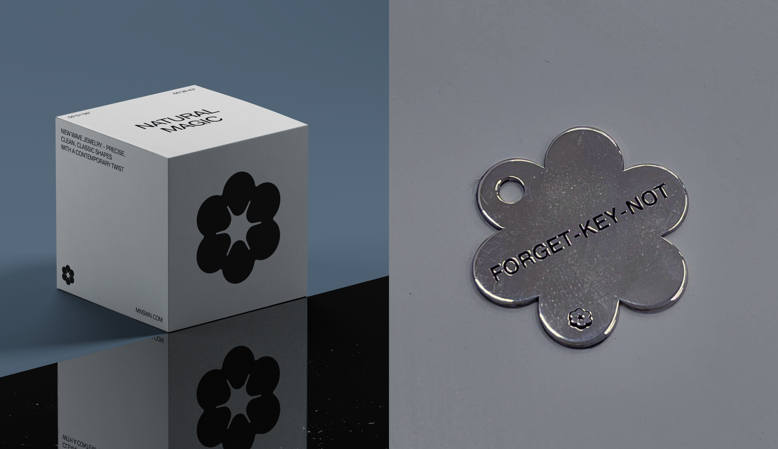
The hexafoil was already a beloved part of Moonswoon’s visual DNA — familiar, trusted, and emotionally resonant with its audience. The symbol was customized by introducing a star at its core, adding a quiet sense of magic and discovery. The resulting form feels both intentional and inevitable — a shape that exists not only in brand language, but in nature itself.
Custom Typeface
The Moonswoon typeface became the backbone of the brand system. Designed specifically for the brand, the typeface functions as a signature rather than a supporting asset. Inspired by Pragmatica and Helvetica, it carries a sense of rationality, precision, and restraint — but softened through subtle corner treatments that echo the smooth alloys of fine jewelry.
Brand Graphics
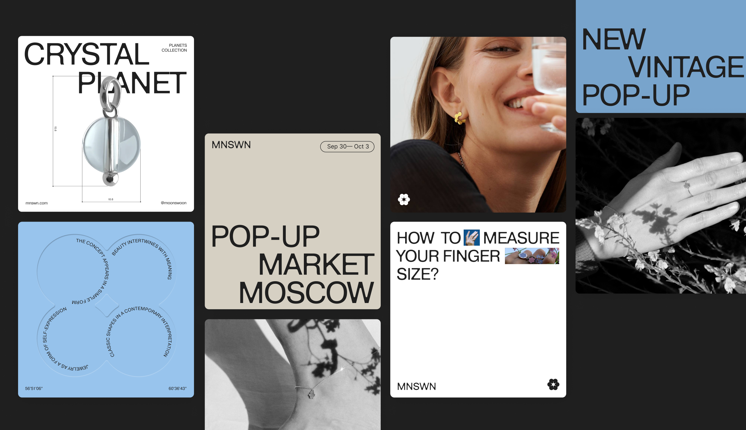
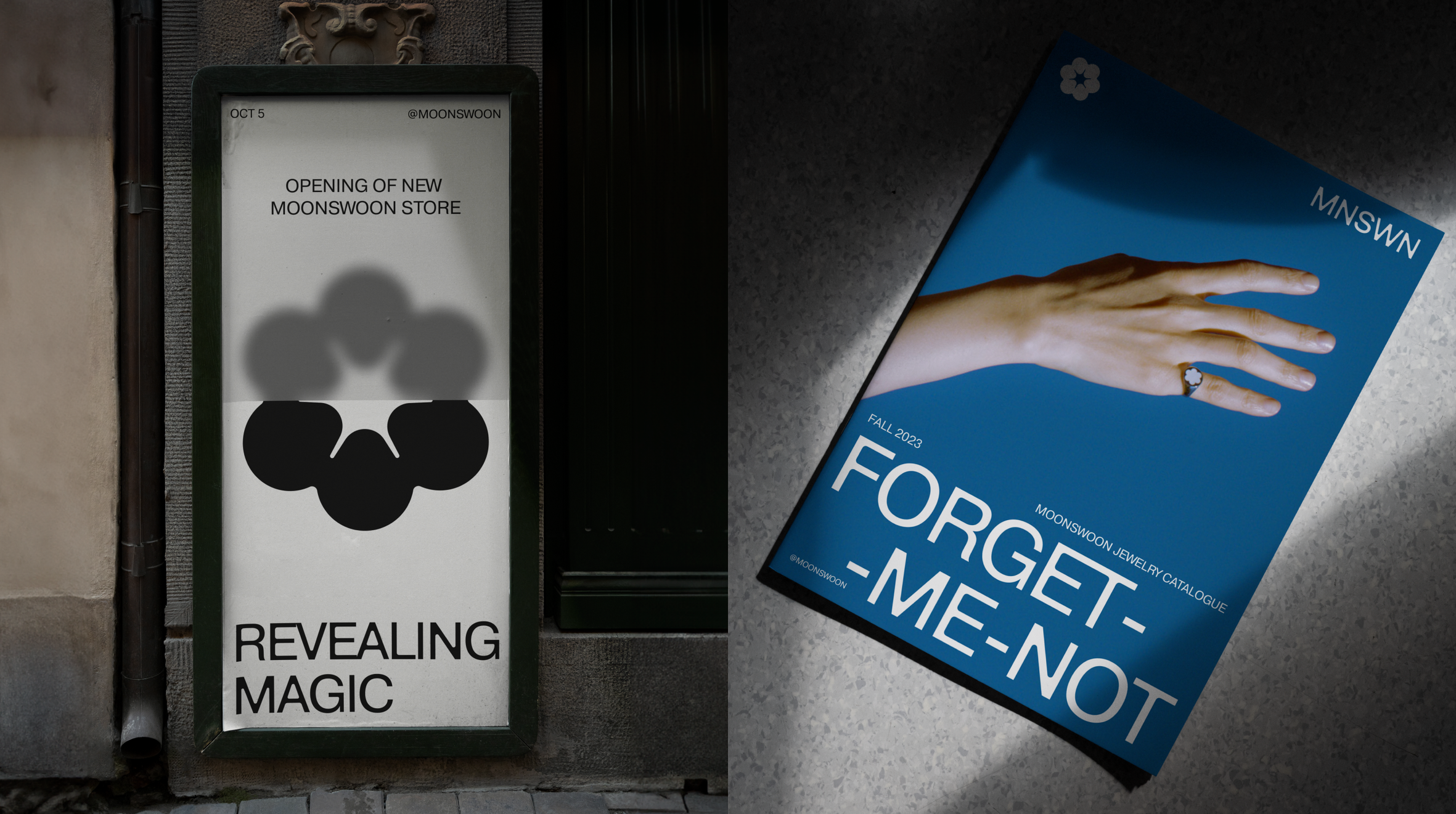
Moonswoon’s visual language is built around the idea of revelation — the moment when something subtle suddenly becomes visible. Blur effects, embossing, riddles, and layered compositions create a system that feels discovered rather than declared. Swiss-inspired typography provides structure, while multi-layering and softness introduce emotion. Together, they form a visual identity that rewards looking twice.
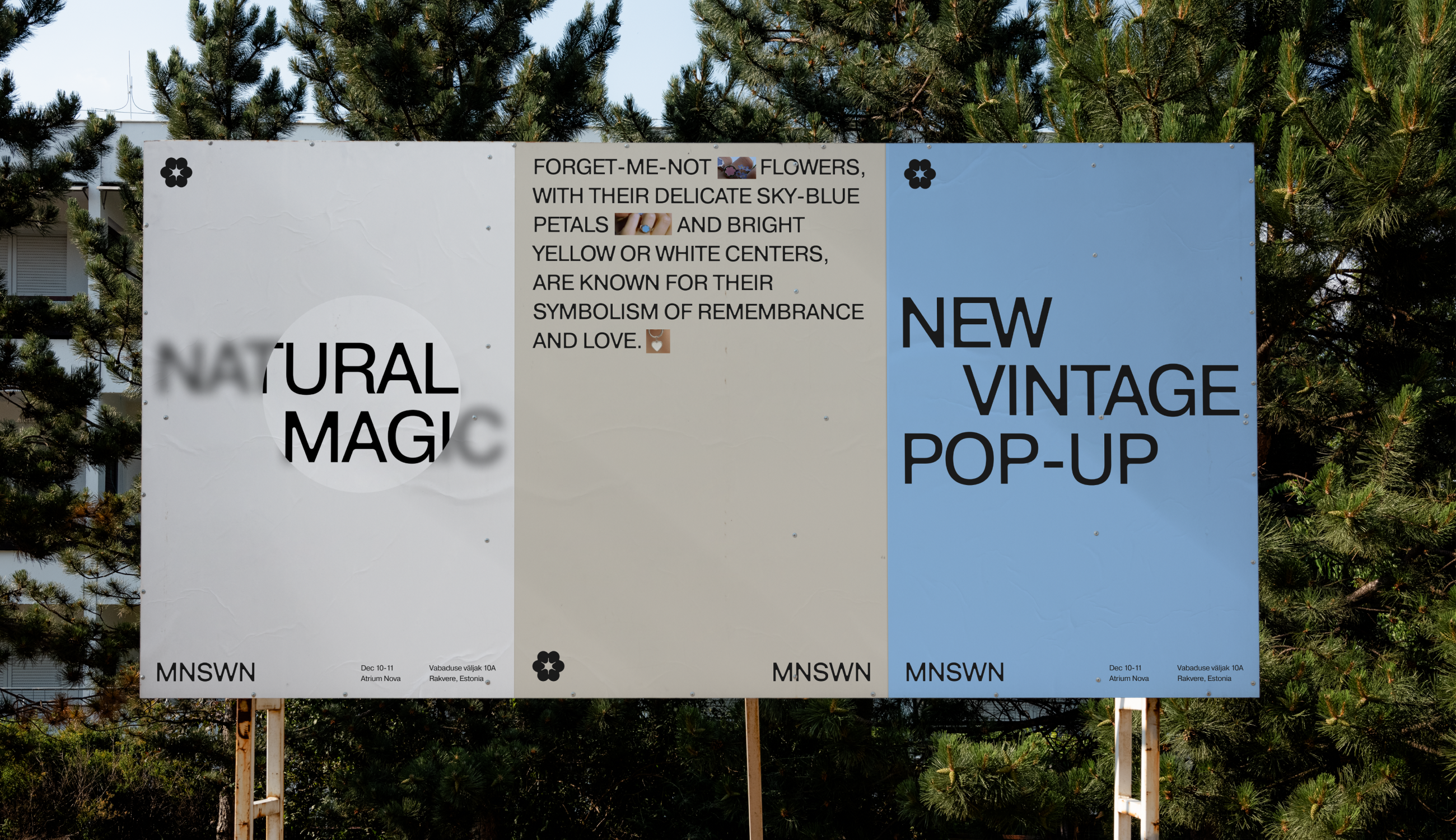
Moonswoon’s visual identity is a quiet revelation — a system designed to bring overlooked details into focus. Clean, but never cold. Distinctive, without shouting. It doesn’t demand attention — it speaks to those who are already listening.

Other Projects

Reach out — let’s make it happen.


+1 (929) 292 06 10
sashadenisova.xyz@gmail.com


Moonswoon is a new wave jewelry brand with its origins in the Ural Mountains, radiating minimalist magic. Rooted in natural and mountain-inspired themes, the brand has already made its mark in Eastern Europe. Under my creative direction the rebranding has unveiled a fresh symbol, typography, a bespoke custom-design typeface, and brand graphics. This new visual identity captures a captivating narrative, highlighting the often overlooked details.
Creative Direction
Brand Identity
Type Design
Design System
Symbol
The hexafoil was already a beloved part of Moonswoon’s visual DNA — familiar, trusted, and emotionally resonant with its audience. The symbol was customized by introducing a star at its core, adding a quiet sense of magic and discovery. The resulting form feels both intentional and inevitable — a shape that exists not only in brand language, but in nature itself.
Custom Typeface
The Moonswoon typeface became the backbone of the brand system. Designed specifically for the brand, the typeface functions as a signature rather than a supporting asset. Inspired by Pragmatica and Helvetica, it carries a sense of rationality, precision, and restraint — but softened through subtle corner treatments that echo the smooth alloys of fine jewelry.
Brand Graphics
Moonswoon’s visual language is built around the idea of revelation — the moment when something subtle suddenly becomes visible. Blur effects, embossing, riddles, and layered compositions create a system that feels discovered rather than declared. Swiss-inspired typography provides structure, while multi-layering and softness introduce emotion. Together, they form a visual identity that rewards looking twice.
Moonswoon’s visual identity is a quiet revelation — a system designed to bring overlooked details into focus. Clean, but never cold. Distinctive, without shouting. It doesn’t demand attention — it speaks to those who are already listening.

Other Projects

Reach out — let’s make it happen.

+1 (929) 292 06 10
sashadenisova.xyz@gmail.com

Moonswoon

The Brand Identity →
Mindsparkle Magazine →
The Brand Identity | Edit Section →
Moonswoon is a new wave jewelry brand with its origins in the Ural Mountains, radiating minimalist magic. Rooted in natural and mountain-inspired themes, the brand has already made its mark in Eastern Europe. Under my creative direction the rebranding has unveiled a fresh symbol, typography, a bespoke custom-design typeface, and brand graphics. This new visual identity captures a captivating narrative, highlighting the often overlooked details.
Creative Direction
Brand Identity
Type Design
Design System
Symbol
The hexafoil was already a beloved part of Moonswoon’s visual DNA — familiar, trusted, and emotionally resonant with its audience. The symbol was customized by introducing a star at its core, adding a quiet sense of magic and discovery. The resulting form feels both intentional and inevitable — a shape that exists not only in brand language, but in nature itself.
Custom Typeface
The Moonswoon typeface became the backbone of the brand system. Designed specifically for the brand, the typeface functions as a signature rather than a supporting asset. Inspired by Pragmatica and Helvetica, it carries a sense of rationality, precision, and restraint — but softened through subtle corner treatments that echo the smooth alloys of fine jewelry.
Brand Graphics
Moonswoon’s visual language is built around the idea of revelation — the moment when something subtle suddenly becomes visible. Blur effects, embossing, riddles, and layered compositions create a system that feels discovered rather than declared. Swiss-inspired typography provides structure, while multi-layering and softness introduce emotion. Together, they form a visual identity that rewards looking twice.
Moonswoon’s visual identity is a quiet revelation — a system designed to bring overlooked details into focus. Clean, but never cold. Distinctive, without shouting. It doesn’t demand attention — it speaks to those who are already listening.

Other Projects

Reach out — let’s make it happen.


+1 (929) 292 06 10
sashadenisova.xyz@gmail.com
