Solzão
Solzão is a vibrant wellness brand under the umbrella of Splat, a leading name in the personal care industry. Solzão introduces a colorful line of shampoos, body gels, conditioners, and other products.
Brand Design
Creative Direction
Type Design
Illustrations
Visual System
Packaging
Inspired by the meaning of "extremely hot sun" in Portuguese, Solzão embodies a hedonistic love for life. The brand promotes self-confidence and a bright, sun-kissed beauty, encouraging women to embrace their natural glow — whether it’s a tan, smooth skin, or sun-bleached hair.
Brand Scope
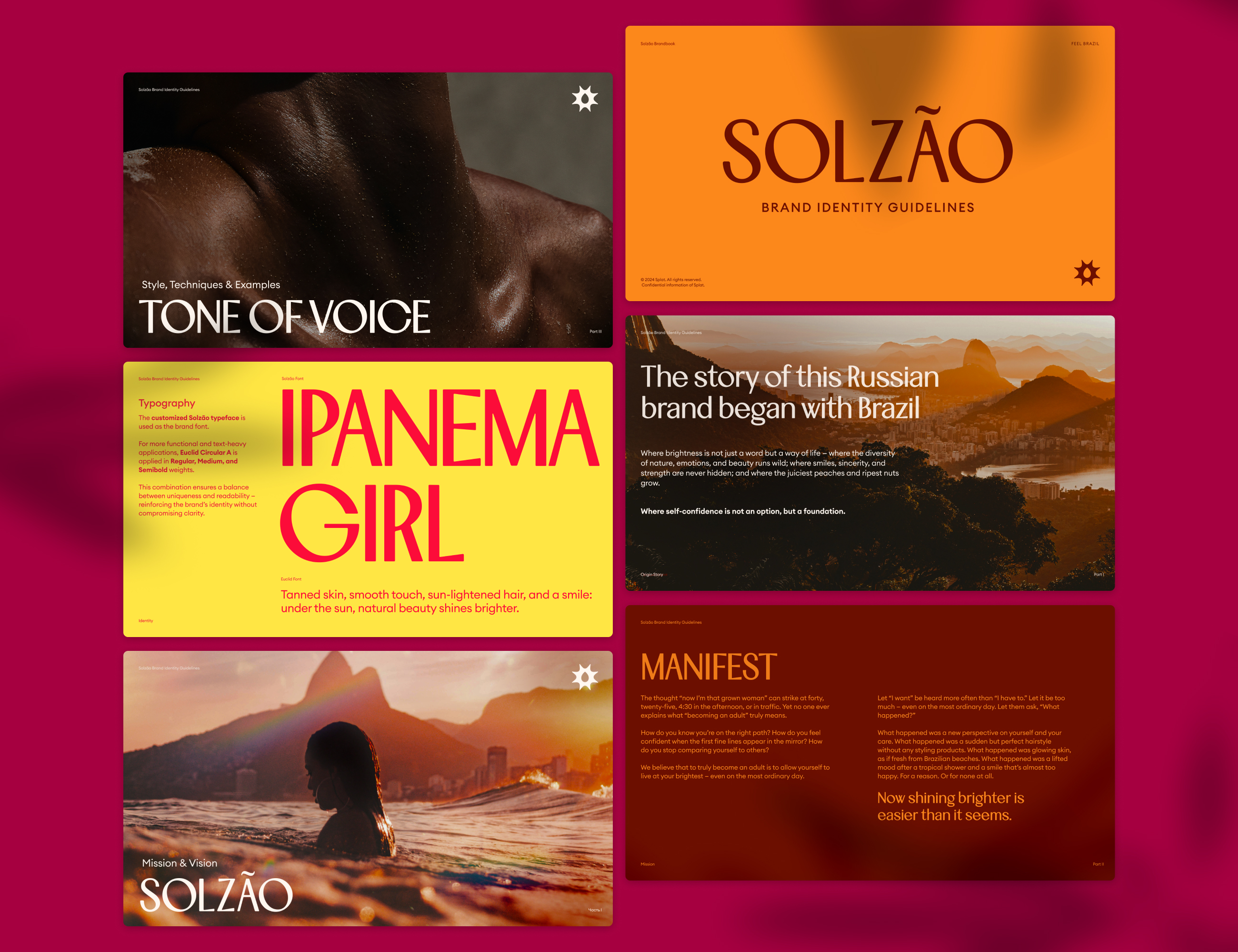
I joined as Creative Director & Brand Designer on the emerging brand, leading identity and brand systems in collaboration with a strategist, product lead, and copywriter. The project encompassed logo creation, visual system development, a bespoke typeface, and detailed guidelines to ensure consistency across all touchpoints.
Shower Gel Line
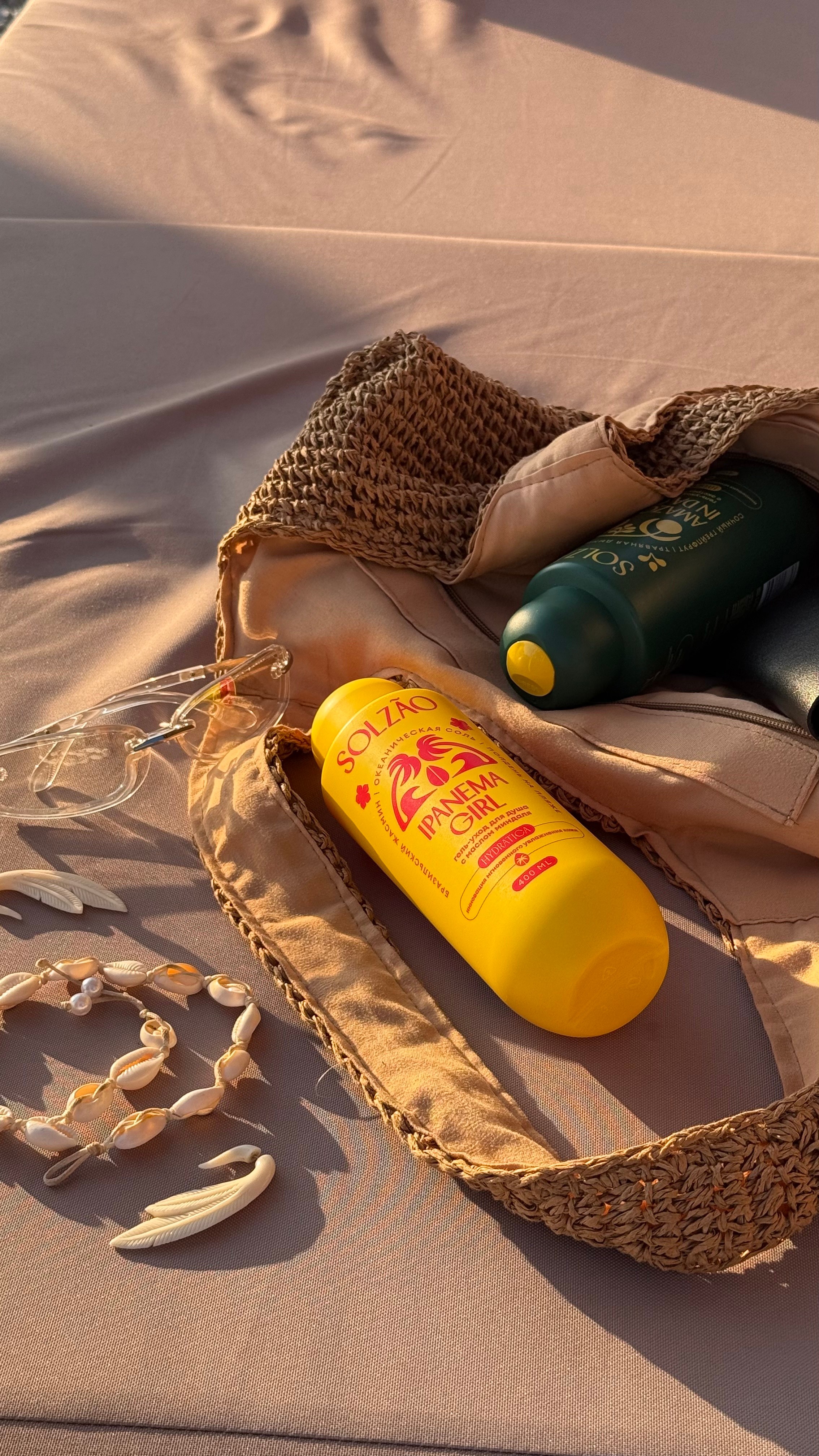
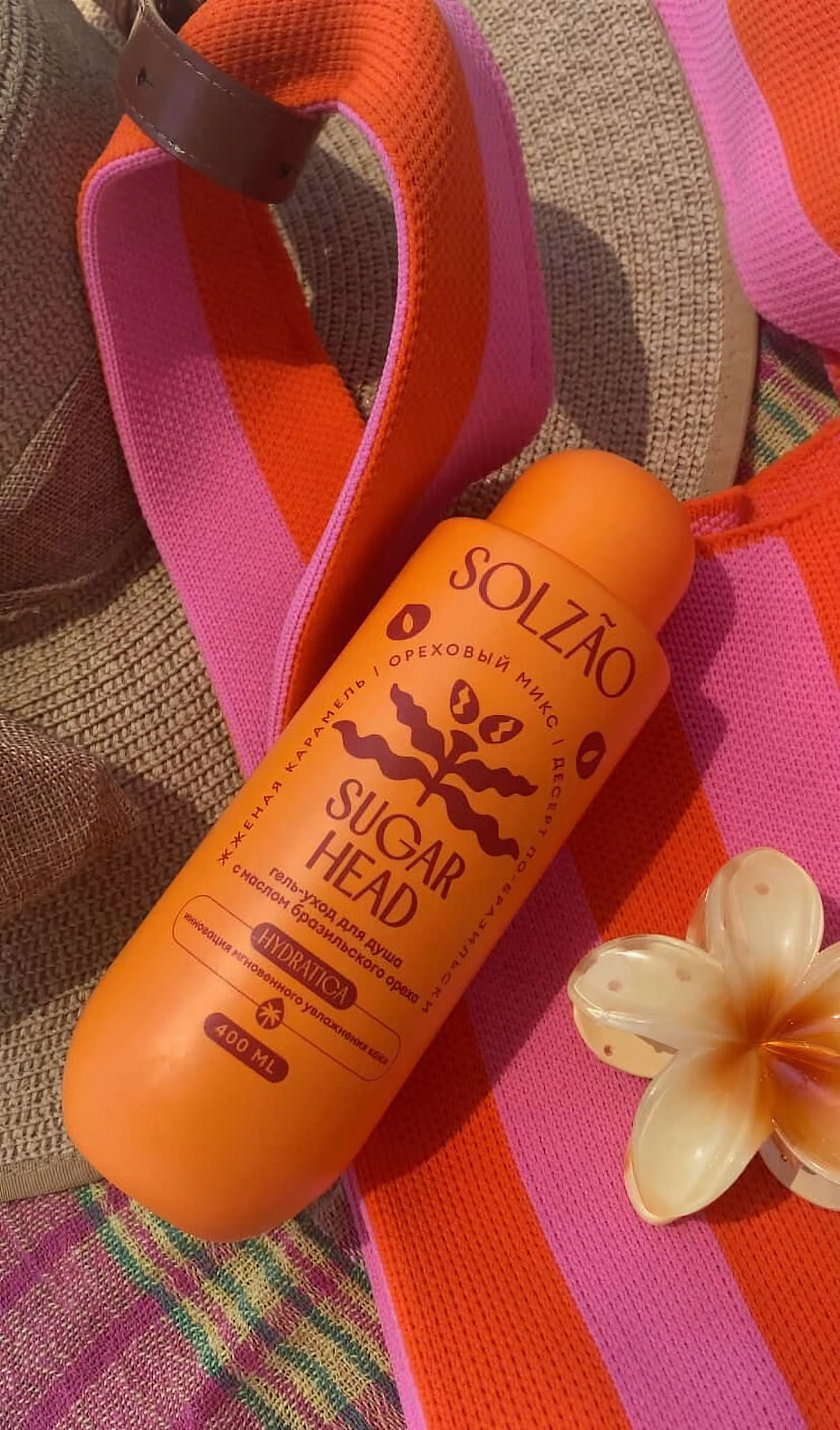
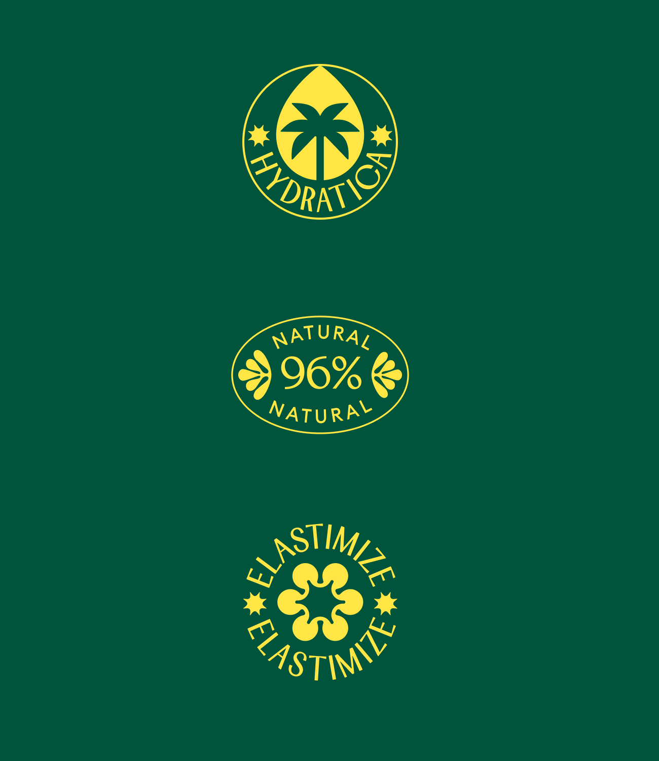
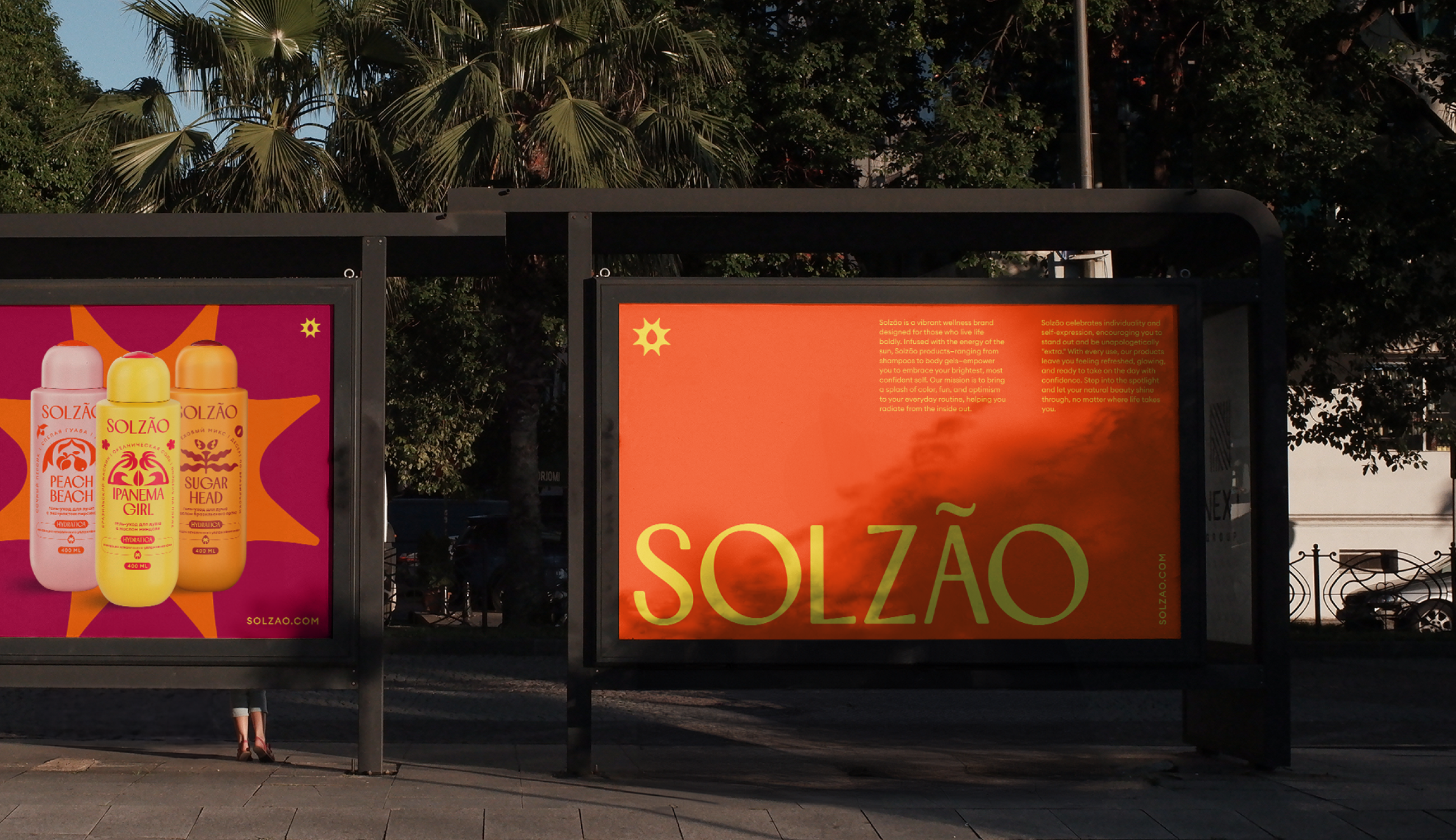
The first Solzão line introduced to market was shower gels, with four distinctive designs that set the direction for all future products. The brand’s arched text style, illustrative elements, and custom typeface established its visual identity across retail. Today, the line sells in the hundreds of thousands, with distribution spanning Russia, Georgia, Kazakhstan, and Eastern Europe.
Graphic Elements
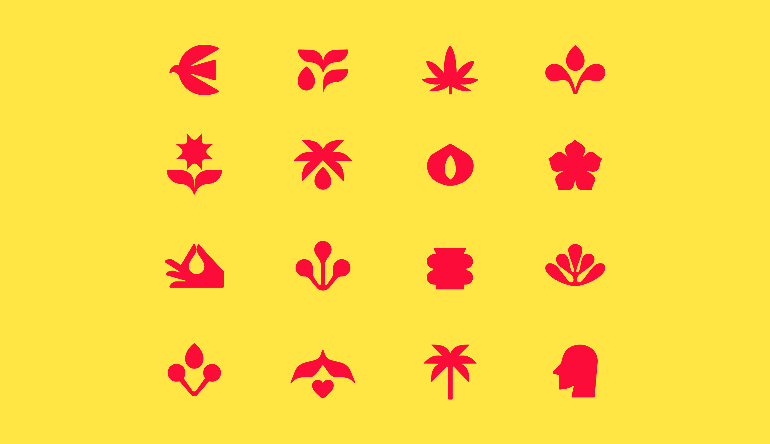
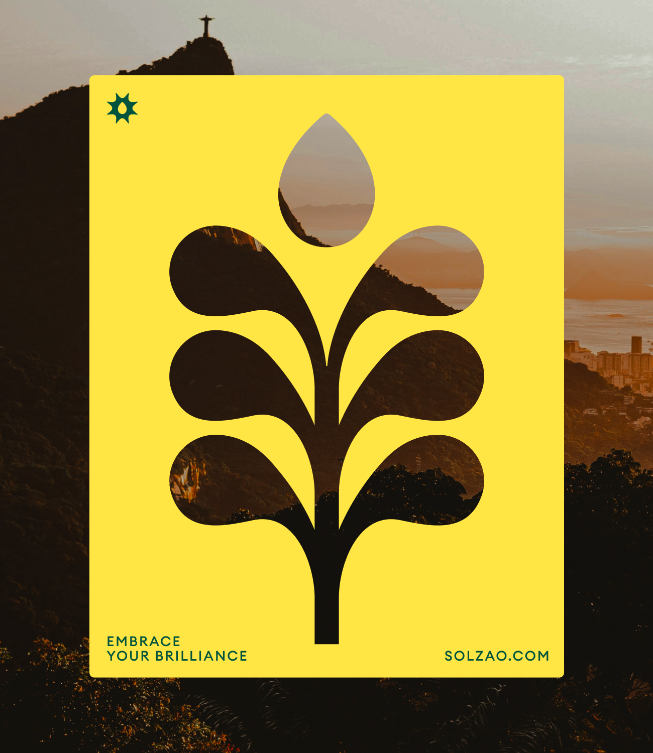
Illustration and bold color combinations lie at the heart of Solzão — evoking a vibrant Brazilian energy and helping the brand stand apart from competitors who rely on literal ingredient photography. The visual identity system allowed seamless scaling into new product lines, while the custom typeface gave Solzão an immediately recognizable presence.
Out in the World
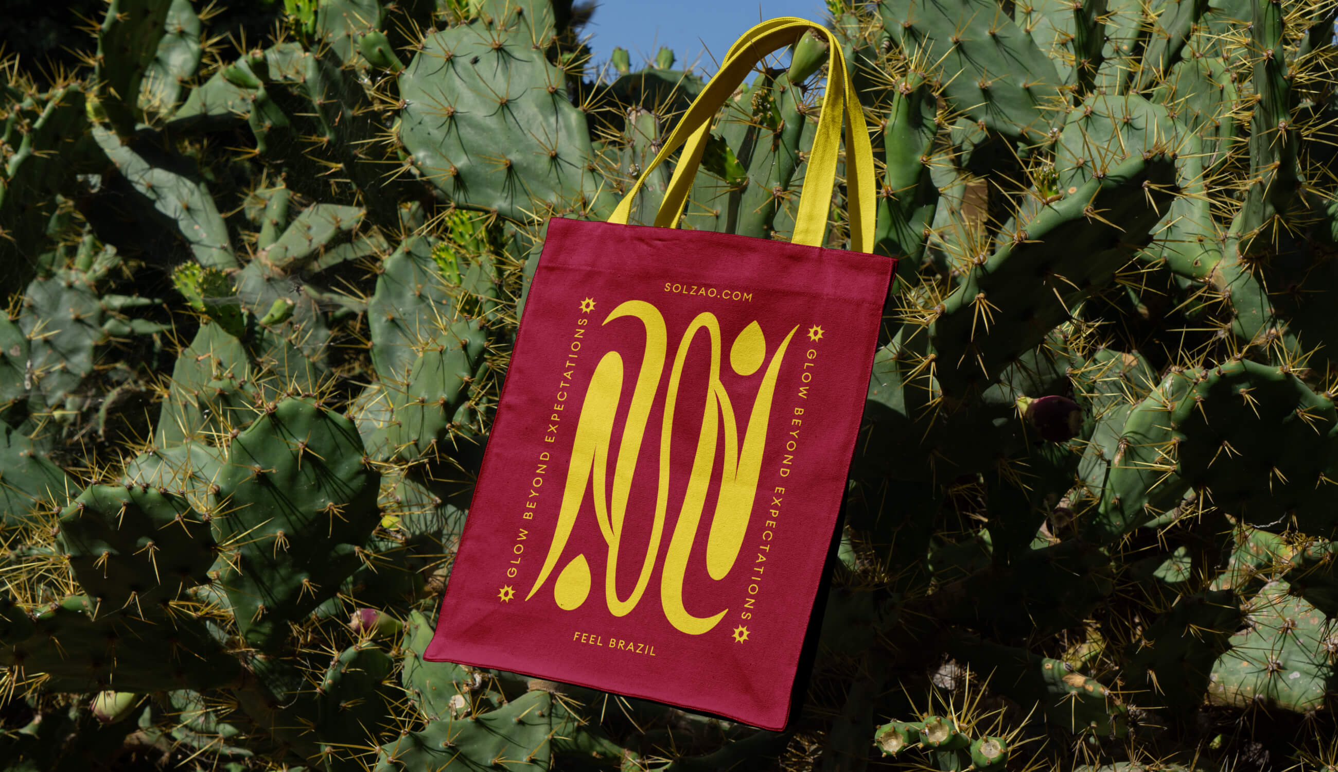
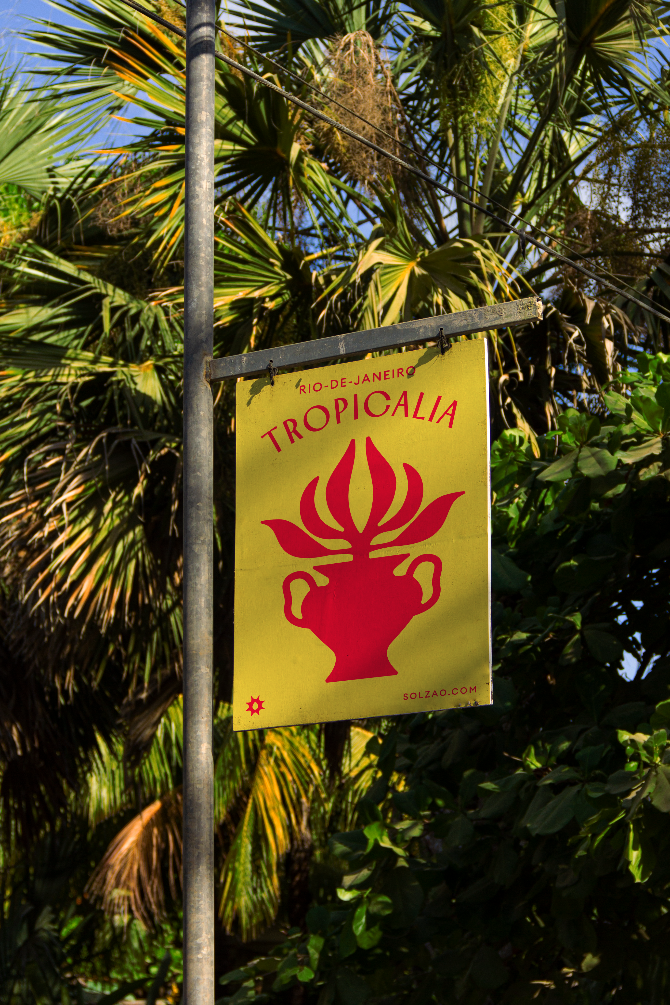
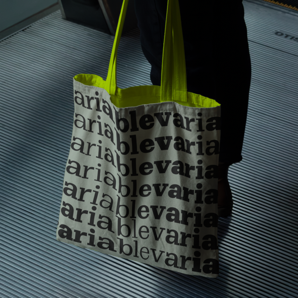
Solzão grew far beyond packaging and digital touchpoints, extending into billboards, event installations, and a wide range of branded merchandise — from stickers and apparel to everyday items that carried the brand’s playful identity into daily life.
Solzão’s mission is to spark smiles and boost confidence daily, driven by the belief that life should be lived with brightness and boldness. Embracing the philosophy of being "extra," the brand celebrates living vividly and unapologetically.
Product Lines
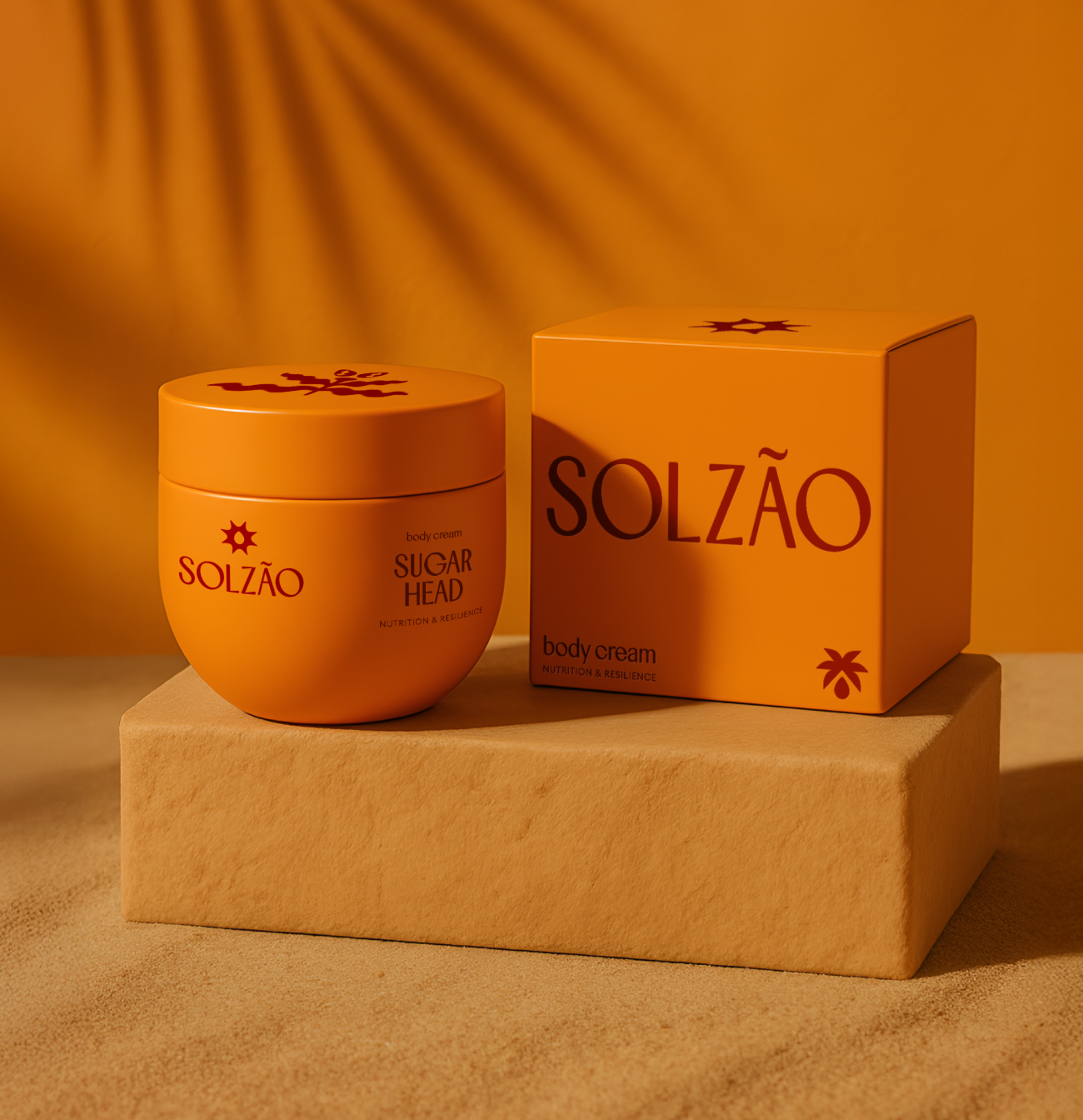
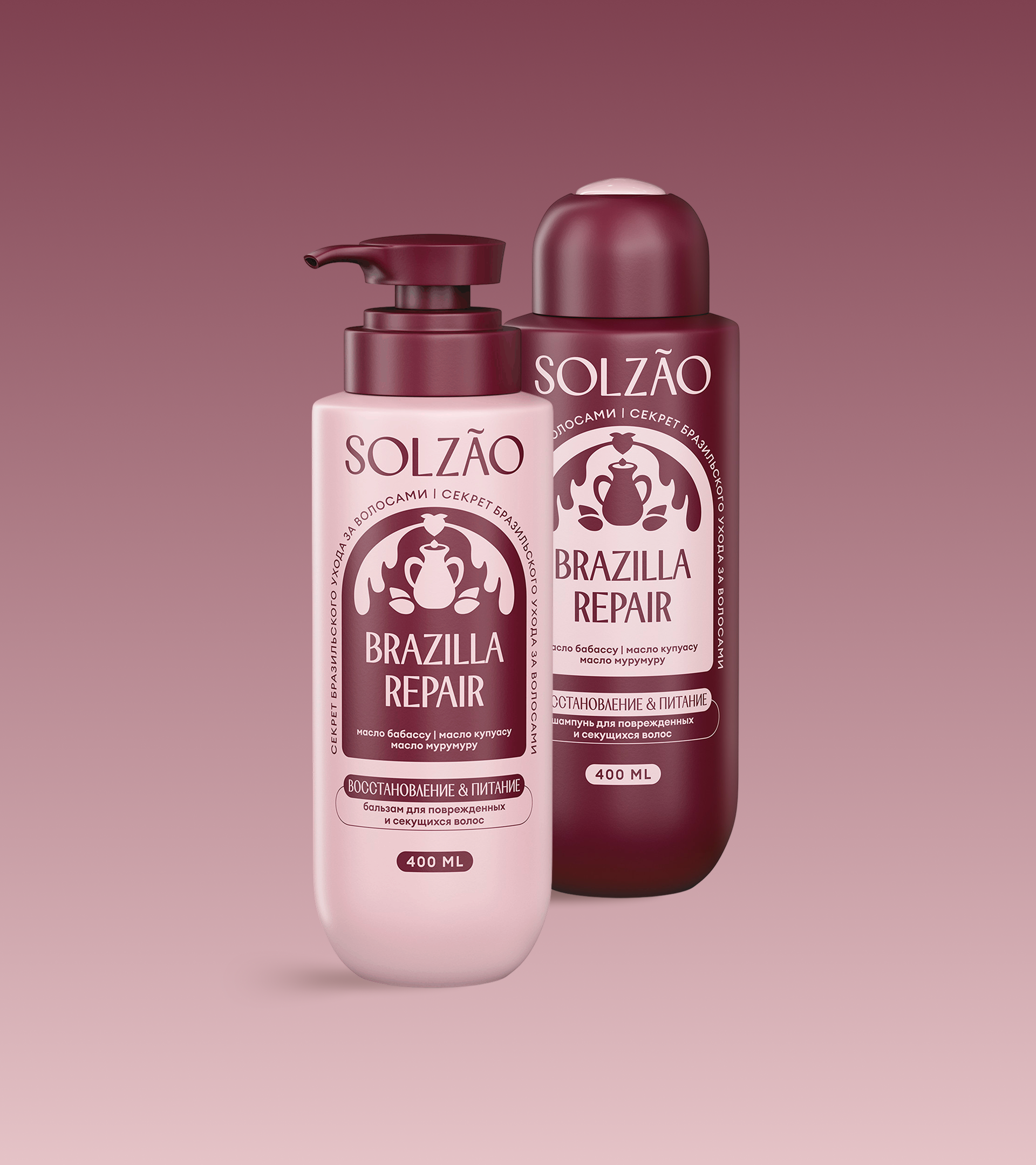
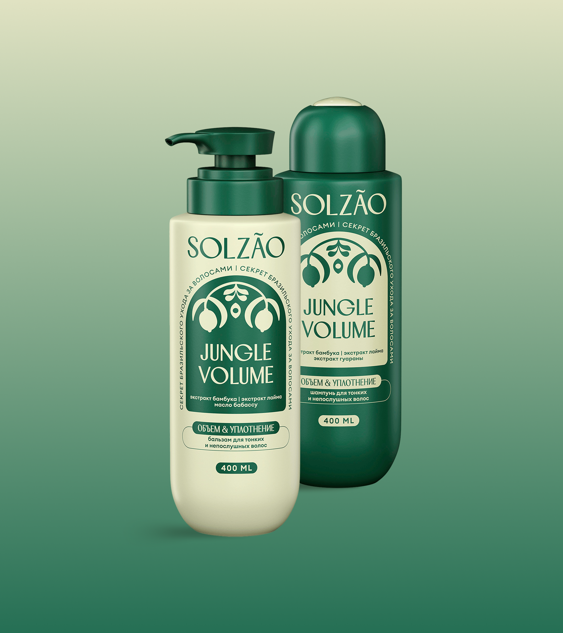
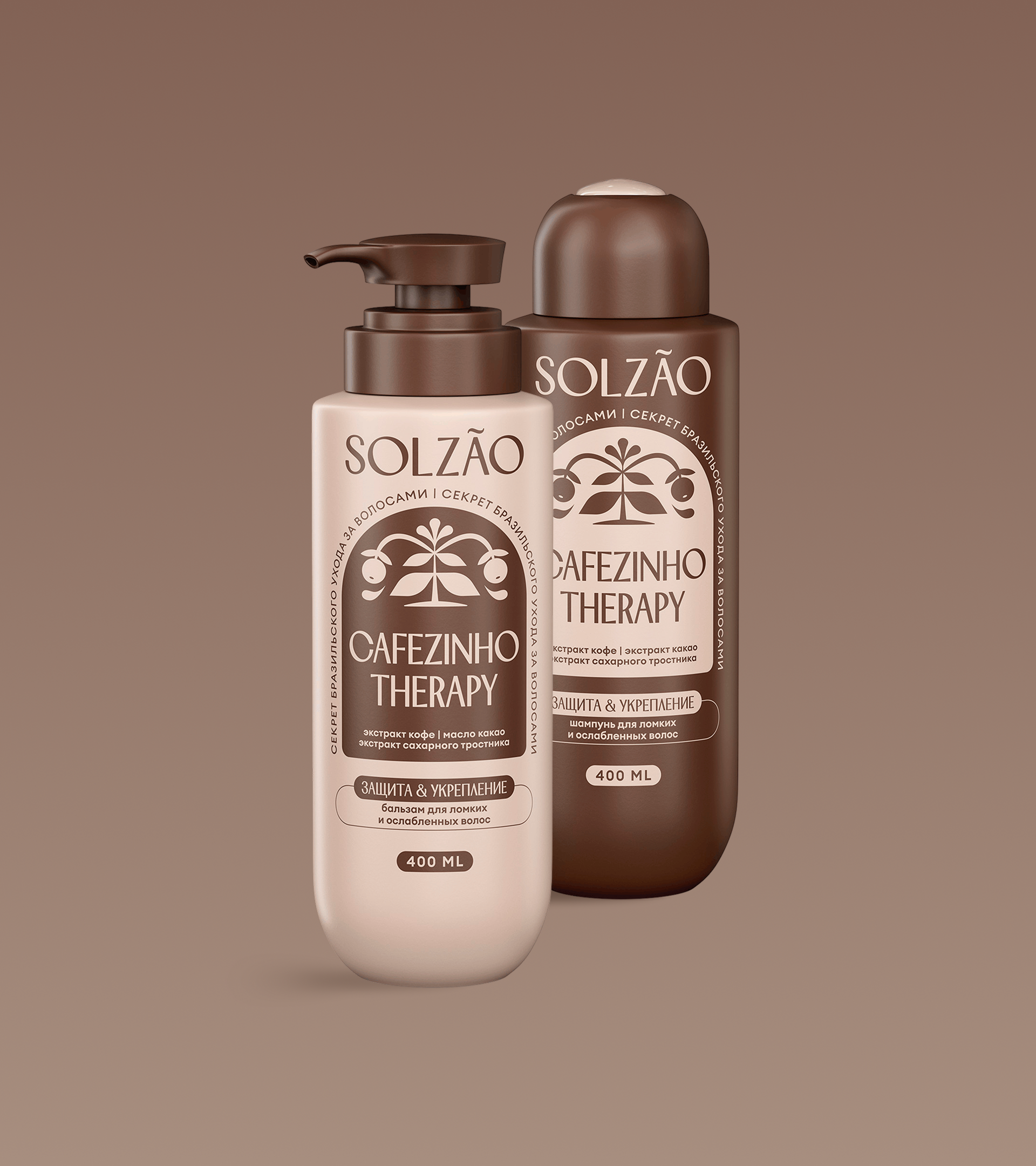
Alongside the shower gels, body creams and hair care products — shampoos and conditioners — were introduced, forming a cohesive product family. The established identity system made it easy to scale the brand into new lines, while the custom typeface gave Solzão an immediately ownable voice across retail.

Brand Guidelines
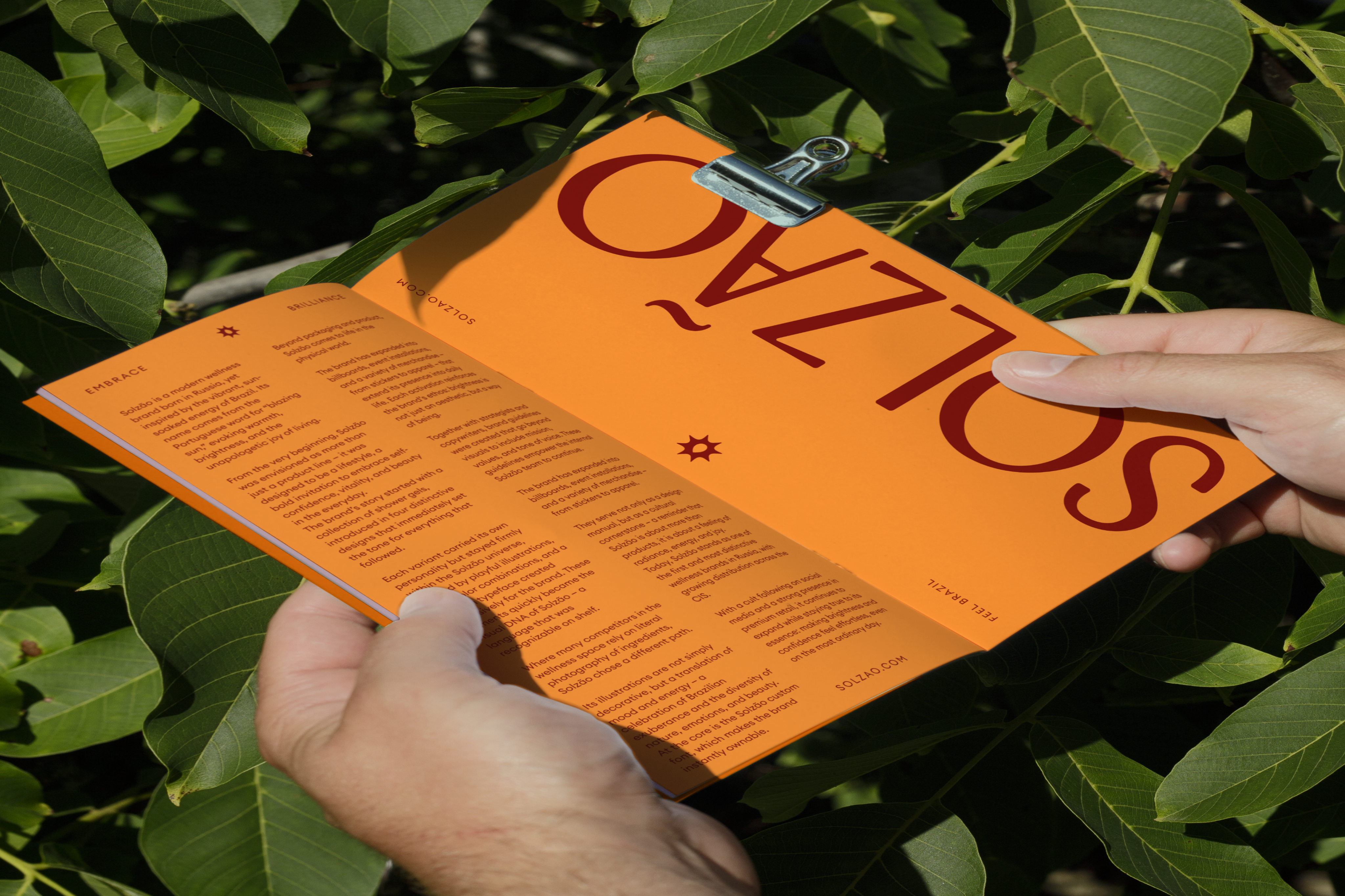
Together with strategy and copy, we crafted a brand framework that unites mission, values, tone, and visual grammar. This framework now serves as the foundation for Solzão’s evolution, guiding the internal team while I continue to advise the brand’s direction.

Other Projects

Reach out — let’s make it happen.


+1 (929) 292 06 10
sashadenisova.xyz@gmail.com


Solzão
Solzão is a vibrant wellness brand under the umbrella of Splat, a leading name in the personal care industry. Solzão introduces a colorful line of shampoos, body gels, conditioners, and other products.
Brand Design
Creative Direction
Type Design
Illustrations
Visual System
Packaging
Inspired by the meaning of "extremely hot sun" in Portuguese, Solzão embodies a hedonistic love for life. The brand promotes self-confidence and a bright, sun-kissed beauty, encouraging women to embrace their natural glow — whether it’s a tan, smooth skin, or sun-bleached hair.
Brand Scope
I joined as Creative Director & Brand Designer on the emerging brand, leading identity and brand systems in collaboration with a strategist, product lead, and copywriter. The project encompassed logo creation, visual system development, a bespoke typeface, and detailed guidelines to ensure consistency across all touchpoints.
Shower Gel Line
The first Solzão line introduced to market was shower gels, with four distinctive designs that set the direction for all future products. The brand’s arched text style, illustrative elements, and custom typeface established its visual identity across retail. Today, the line sells in the hundreds of thousands, with distribution spanning Russia, Georgia, Kazakhstan, and Eastern Europe.
Graphic Elements
Illustration and bold color combinations lie at the heart of Solzão — evoking a vibrant Brazilian energy and helping the brand stand apart from competitors who rely on literal ingredient photography. The visual identity system allowed seamless scaling into new product lines, while the custom typeface gave Solzão an immediately recognizable presence.
Out in the World
Solzão grew far beyond packaging and digital touchpoints, extending into billboards, event installations, and a wide range of branded merchandise — from stickers and apparel to everyday items that carried the brand’s playful identity into daily life.
Solzão’s mission is to spark smiles and boost confidence daily, driven by the belief that life should be lived with brightness and boldness. Embracing the philosophy of being "extra," the brand celebrates living vividly and unapologetically.
Product Lines
Alongside the shower gels, body creams and hair care products — shampoos and conditioners — were introduced, forming a cohesive product family. The established identity system made it easy to scale the brand into new lines, while the custom typeface gave Solzão an immediately ownable voice across retail.
Brand Guidelines
Together with strategy and copy, we crafted a brand framework that unites mission, values, tone, and visual grammar. This framework now serves as the foundation for Solzão’s evolution, guiding the internal team while I continue to advise the brand’s direction.

Other Projects

Reach out — let’s make it happen.

+1 (929) 292 06 10
sashadenisova.xyz@gmail.com

Solzão
Solzão is a vibrant wellness brand under the umbrella of Splat, a leading name in the personal care industry. Solzão introduces a colorful line of shampoos, body gels, conditioners, and other products.
Brand Design
Creative Direction
Type Design
Illustrations
Visual System
Packaging
Inspired by the meaning of "extremely hot sun" in Portuguese, Solzão embodies a hedonistic love for life. The brand promotes self-confidence and a bright, sun-kissed beauty, encouraging women to embrace their natural glow — whether it’s a tan, smooth skin, or sun-bleached hair.
Brand Scope
I joined as Creative Director & Brand Designer on the emerging brand, leading identity and brand systems in collaboration with a strategist, product lead, and copywriter. The project encompassed logo creation, visual system development, a bespoke typeface, and detailed guidelines to ensure consistency across all touchpoints.
Shower Gel Line
The first Solzão line introduced to market was shower gels, with four distinctive designs that set the direction for all future products. The brand’s arched text style, illustrative elements, and custom typeface established its visual identity across retail. Today, the line sells in the hundreds of thousands, with distribution spanning Russia, Georgia, Kazakhstan, and Eastern Europe.
Graphic Elements
Illustration and bold color combinations lie at the heart of Solzão — evoking a vibrant Brazilian energy and helping the brand stand apart from competitors who rely on literal ingredient photography. The visual identity system allowed seamless scaling into new product lines, while the custom typeface gave Solzão an immediately recognizable presence.
Out in the World
Solzão grew far beyond packaging and digital touchpoints, extending into billboards, event installations, and a wide range of branded merchandise — from stickers and apparel to everyday items that carried the brand’s playful identity into daily life.
Solzão’s mission is to spark smiles and boost confidence daily, driven by the belief that life should be lived with brightness and boldness. Embracing the philosophy of being "extra," the brand celebrates living vividly and unapologetically.
Product Lines
Alongside the shower gels, body creams and hair care products — shampoos and conditioners — were introduced, forming a cohesive product family. The established identity system made it easy to scale the brand into new lines, while the custom typeface gave Solzão an immediately ownable voice across retail.
Brand Guidelines
Together with strategy and copy, we crafted a brand framework that unites mission, values, tone, and visual grammar. This framework now serves as the foundation for Solzão’s evolution, guiding the internal team while I continue to advise the brand’s direction.

Other Projects

Reach out — let’s make it happen.


+1 (929) 292 06 10
sashadenisova.xyz@gmail.com
