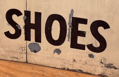
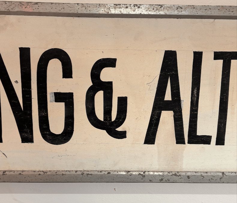
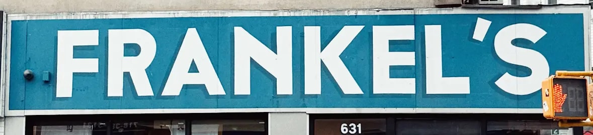
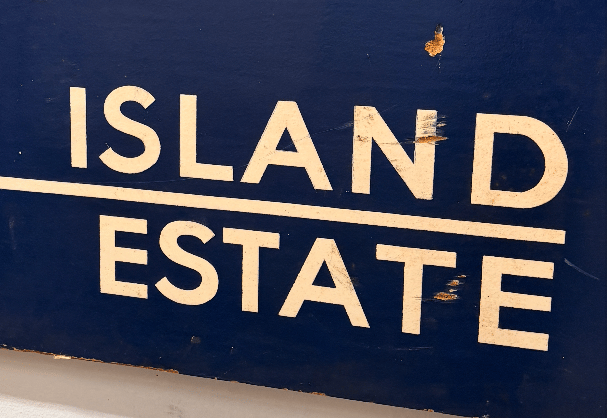
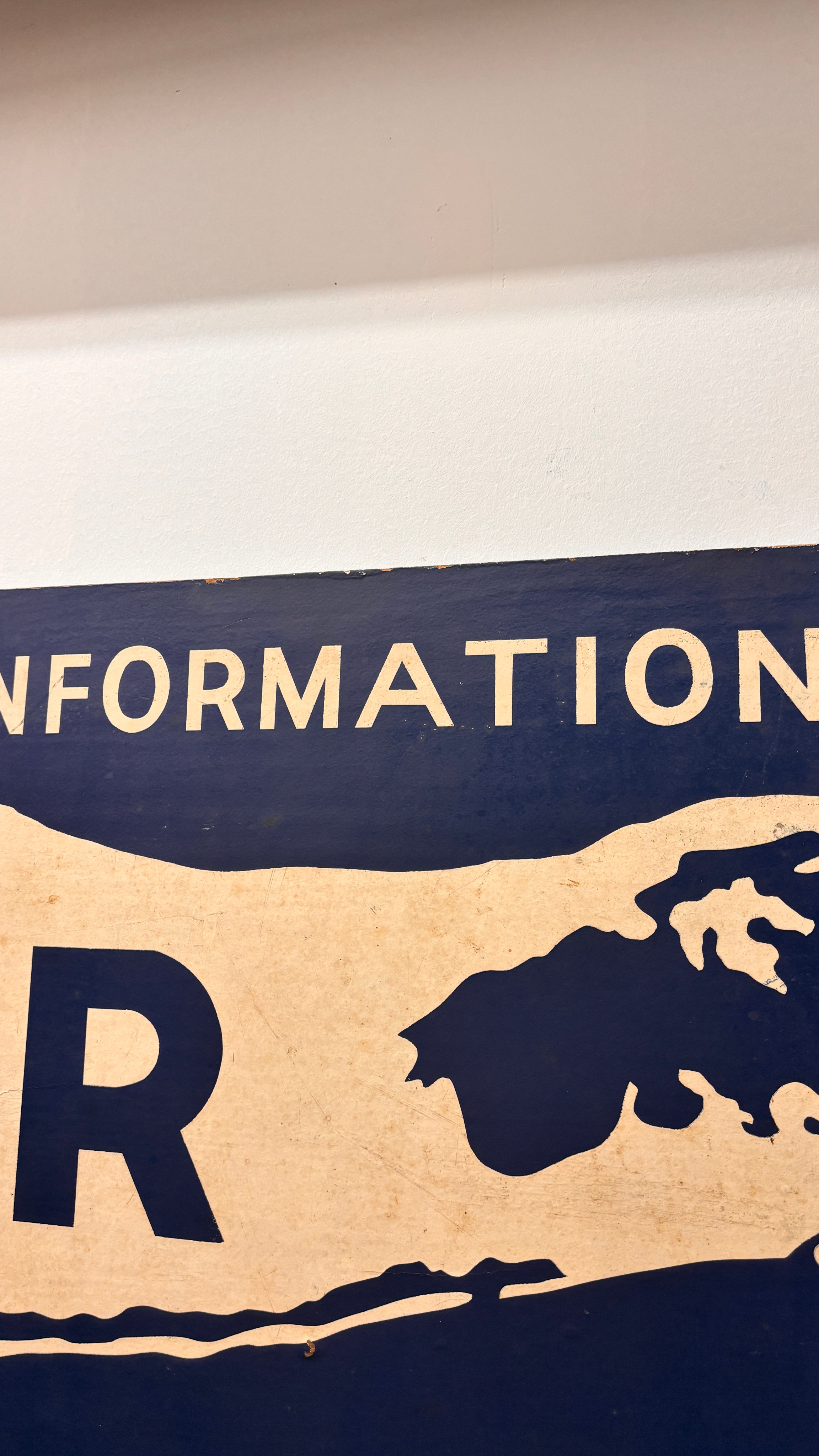
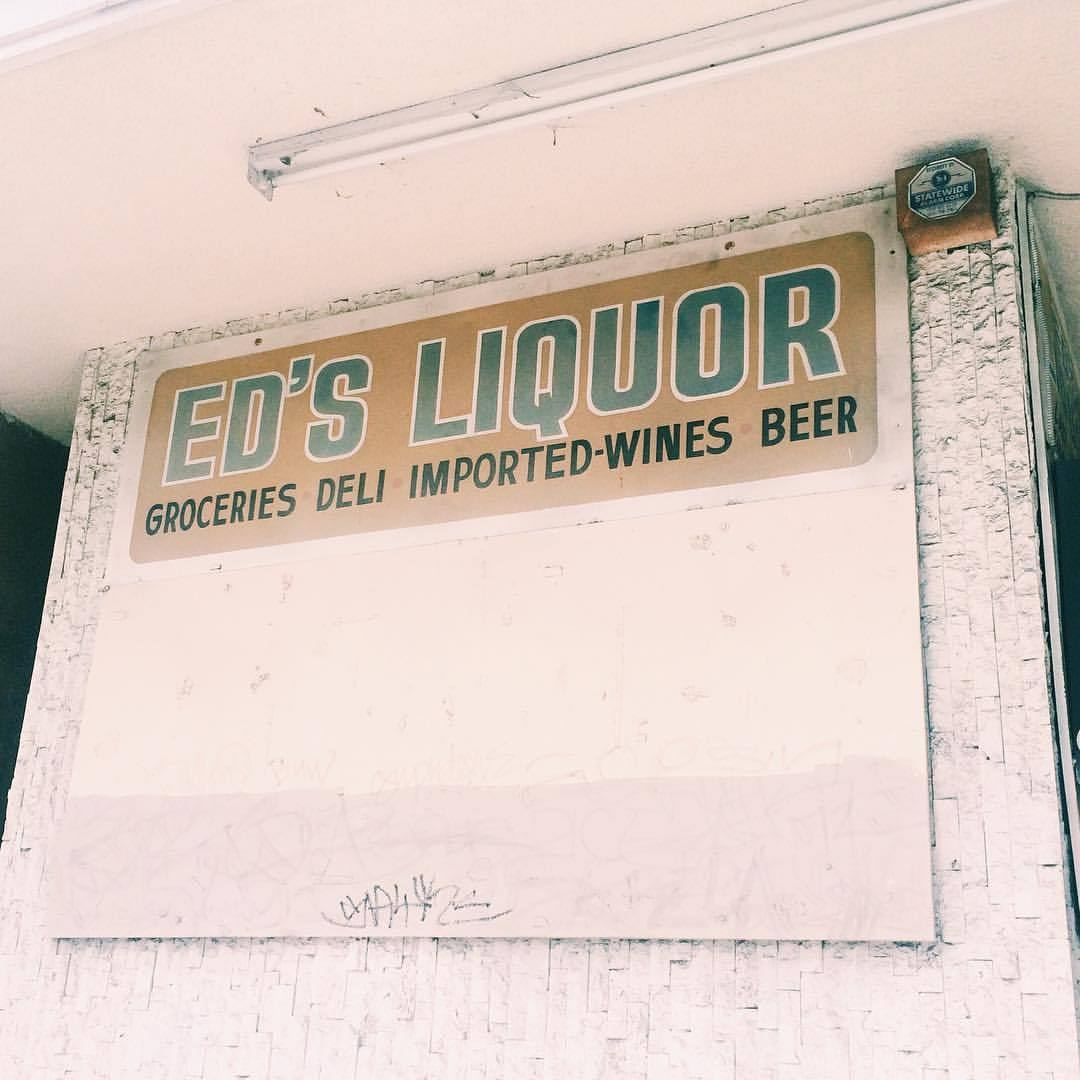
Study of Vernacular
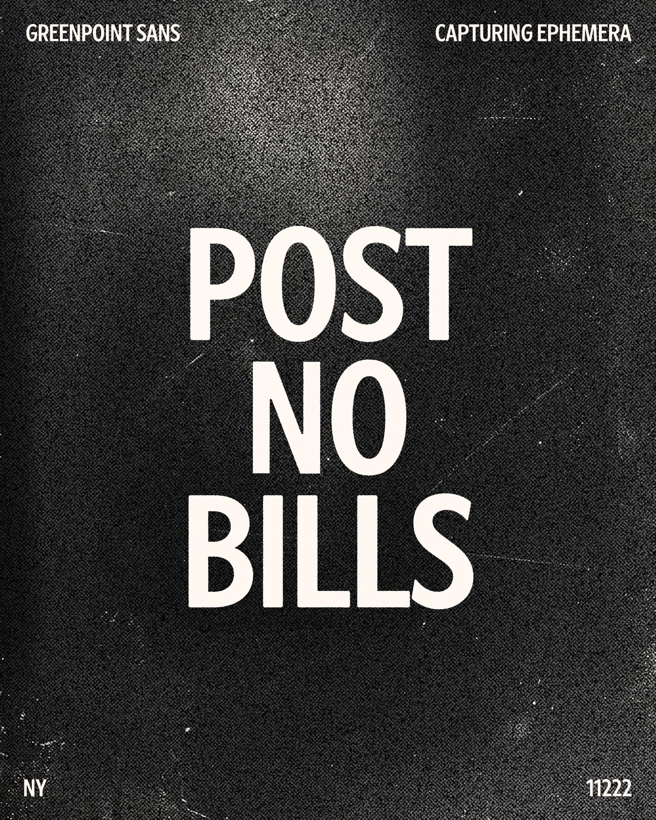
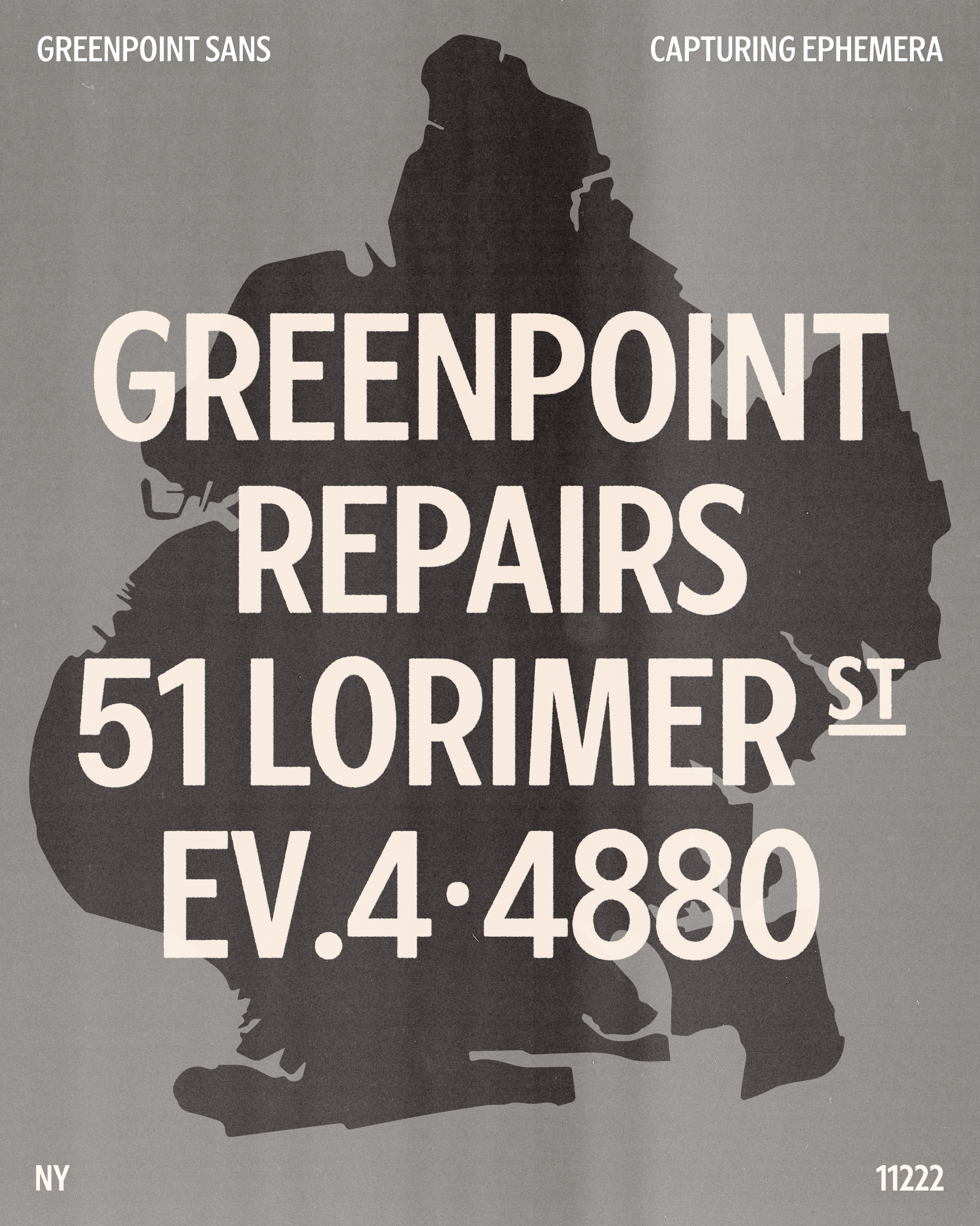
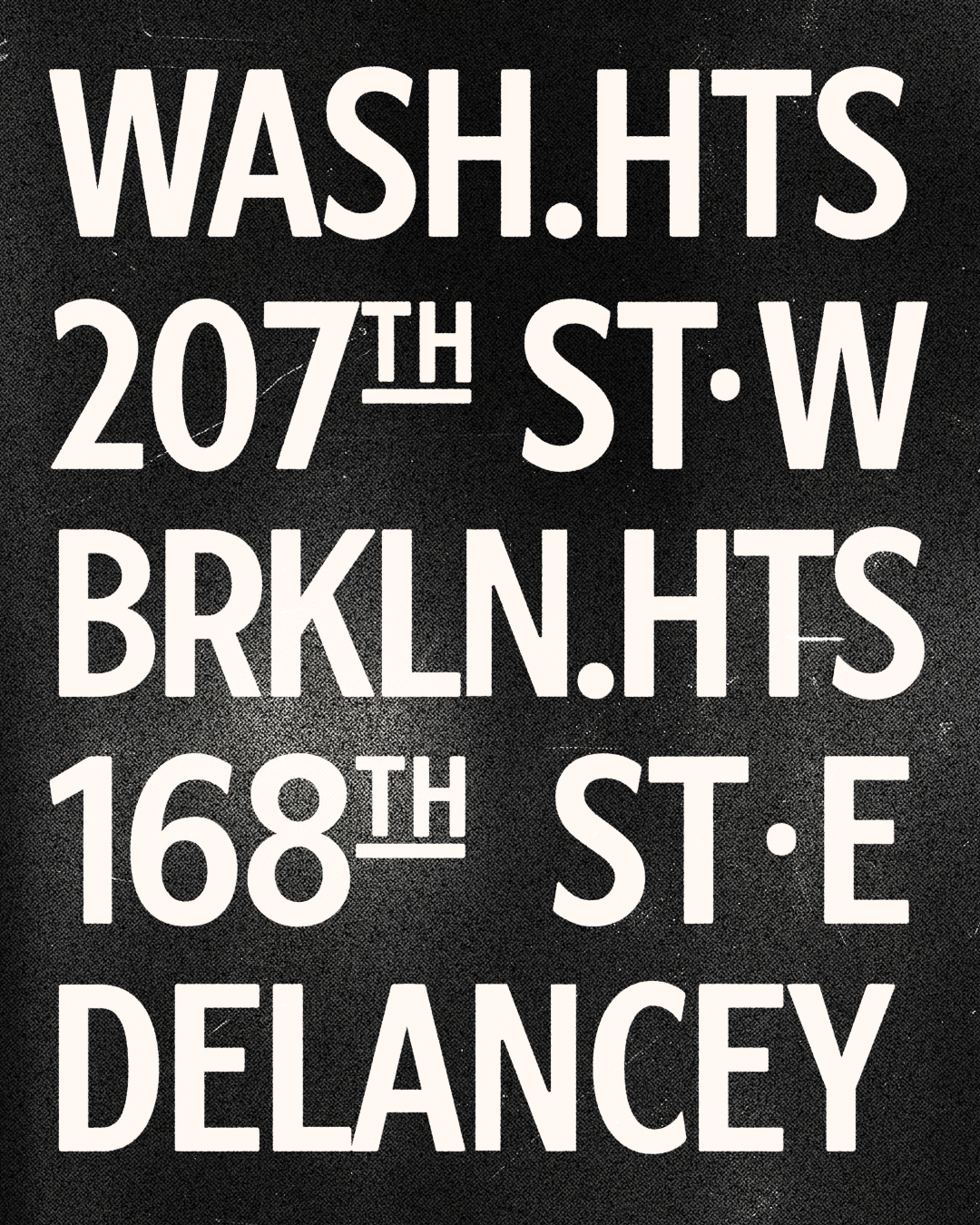
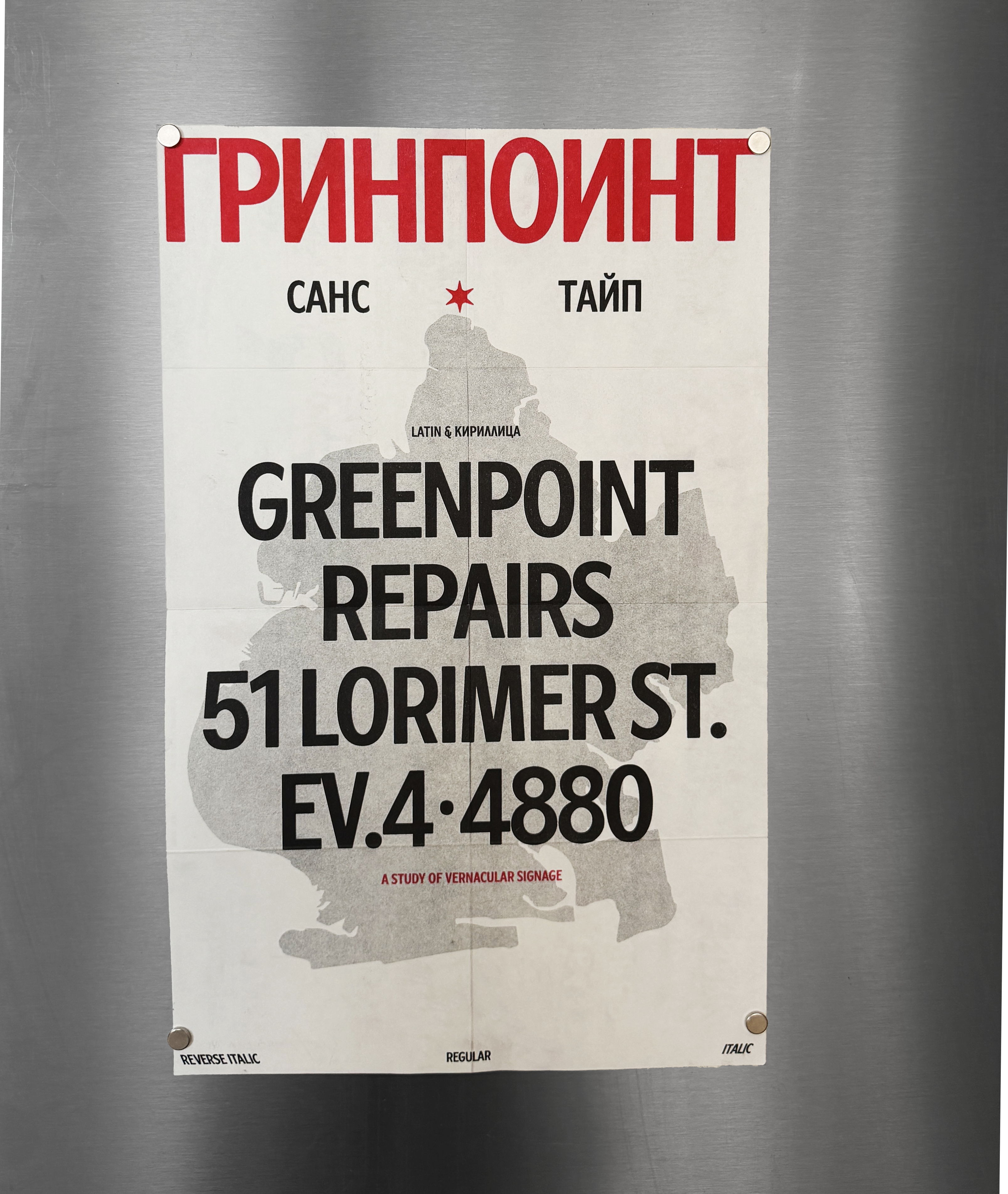
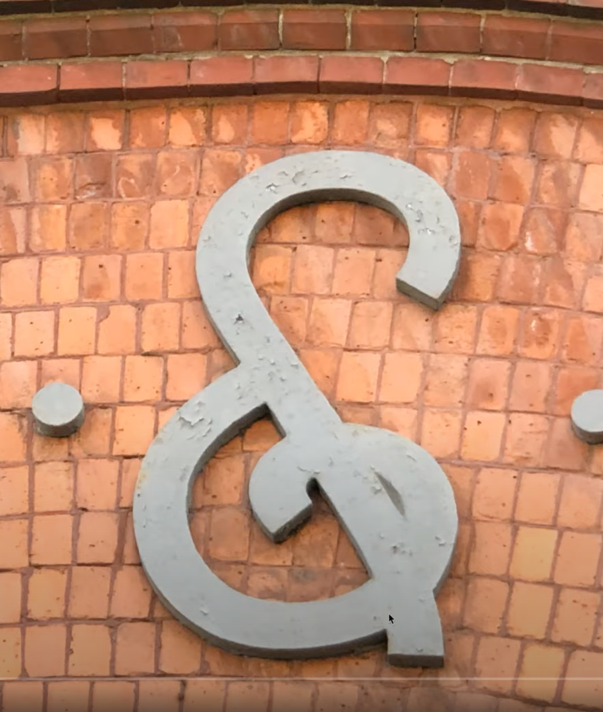
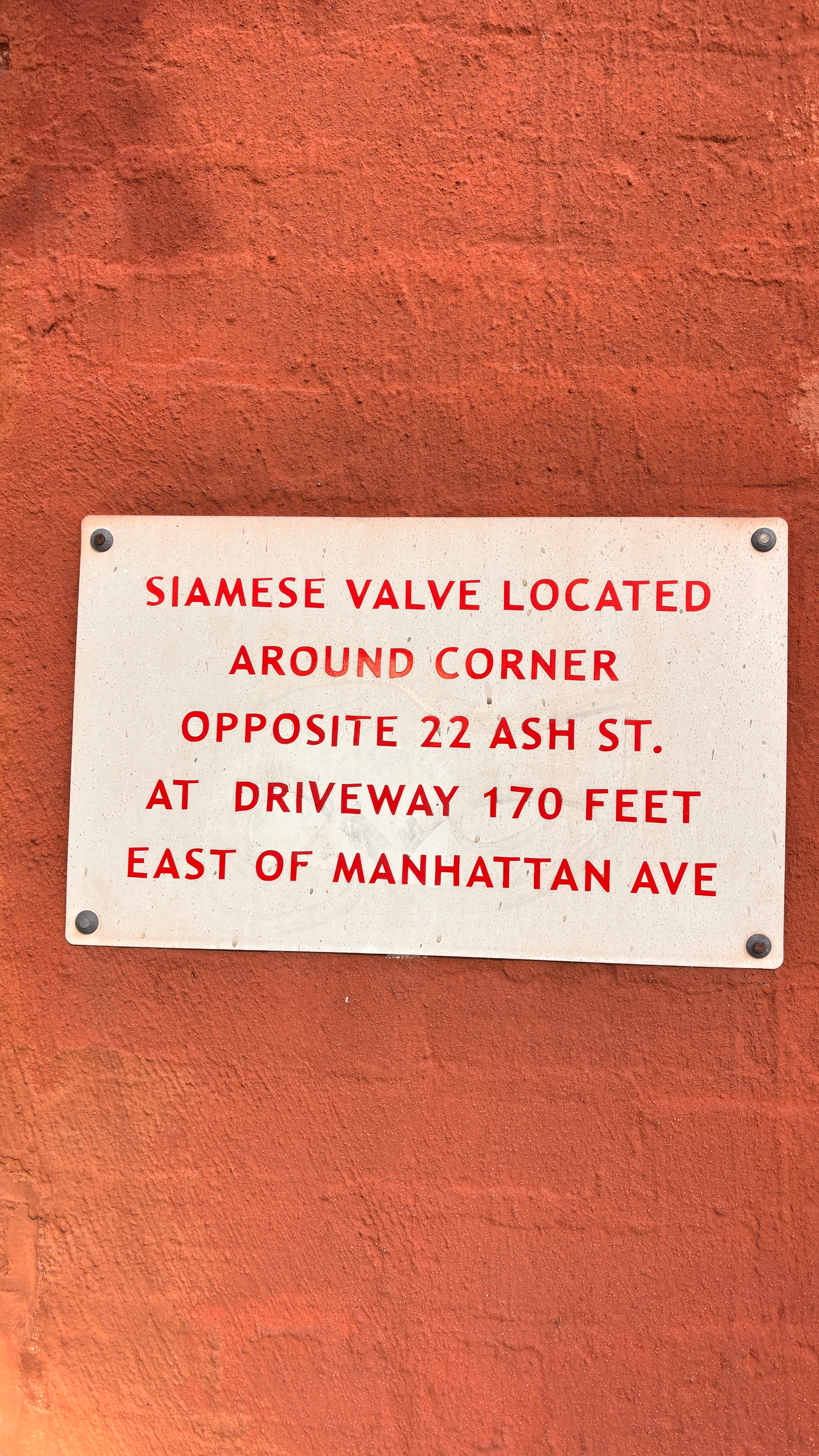
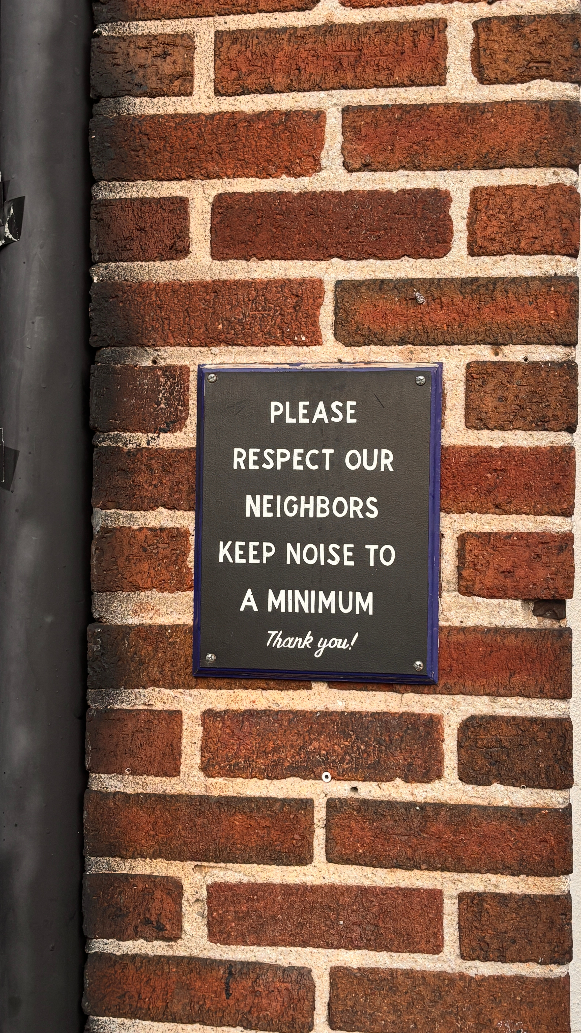
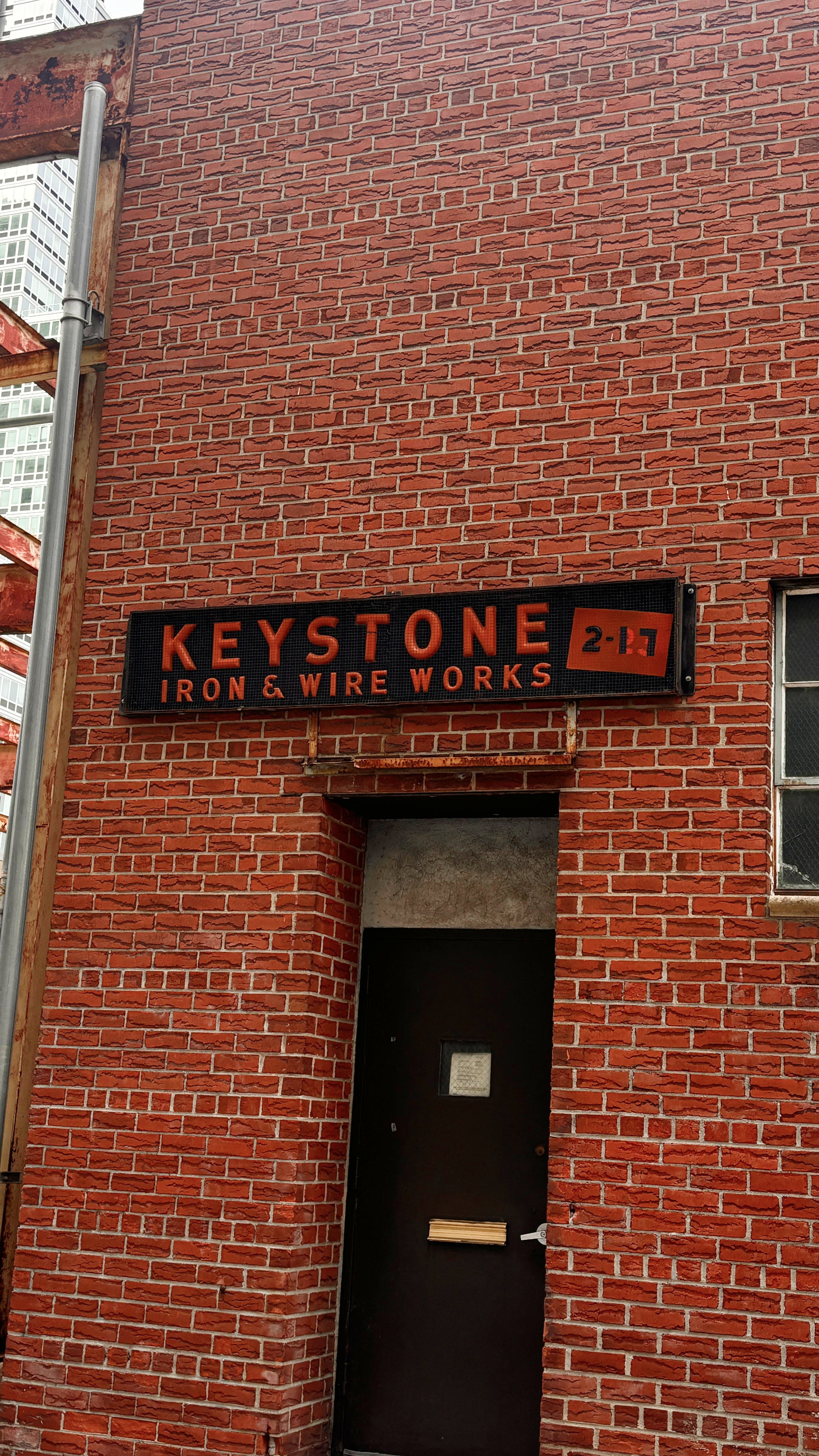
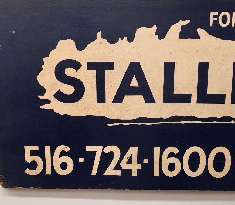
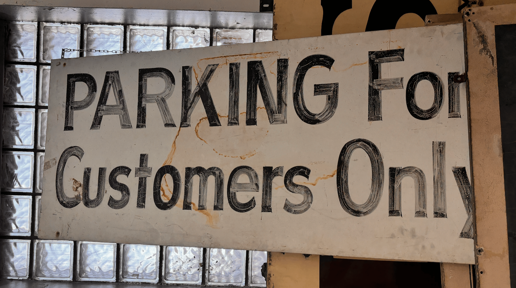
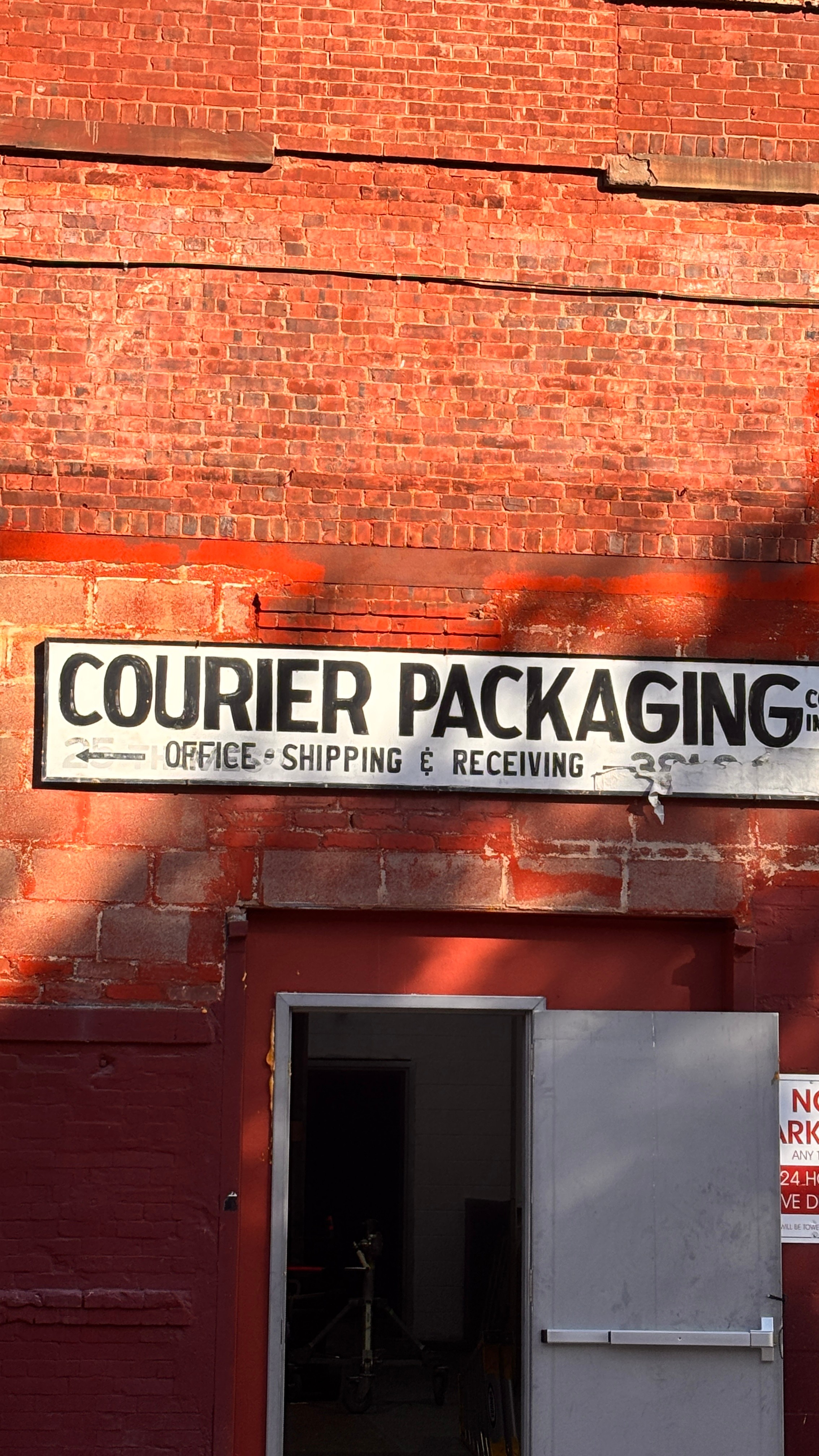
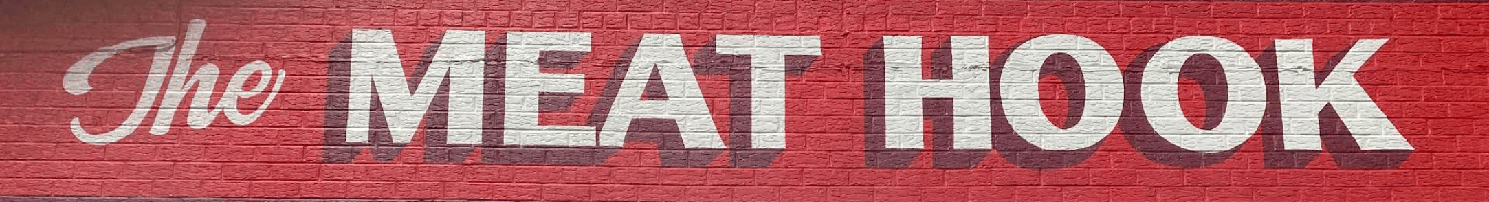
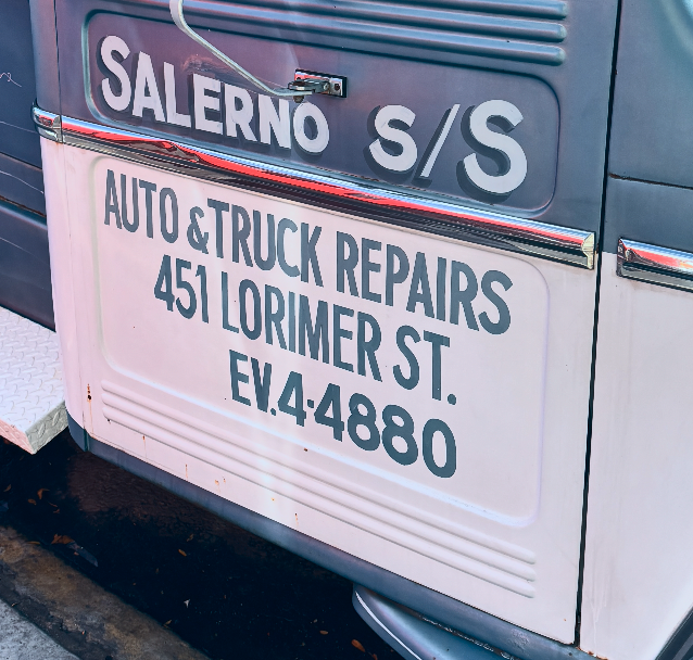
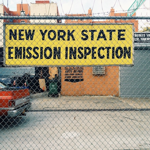
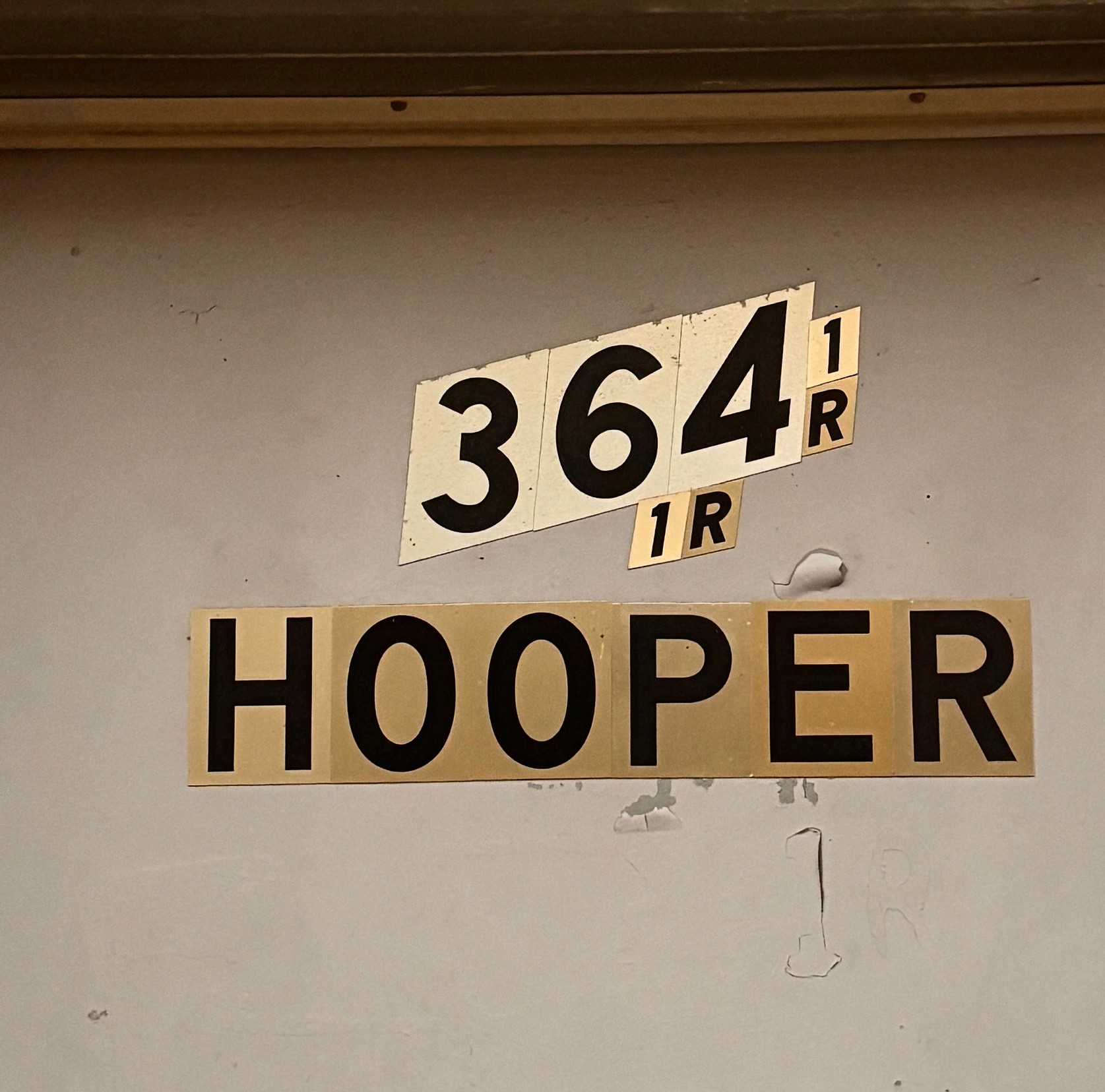
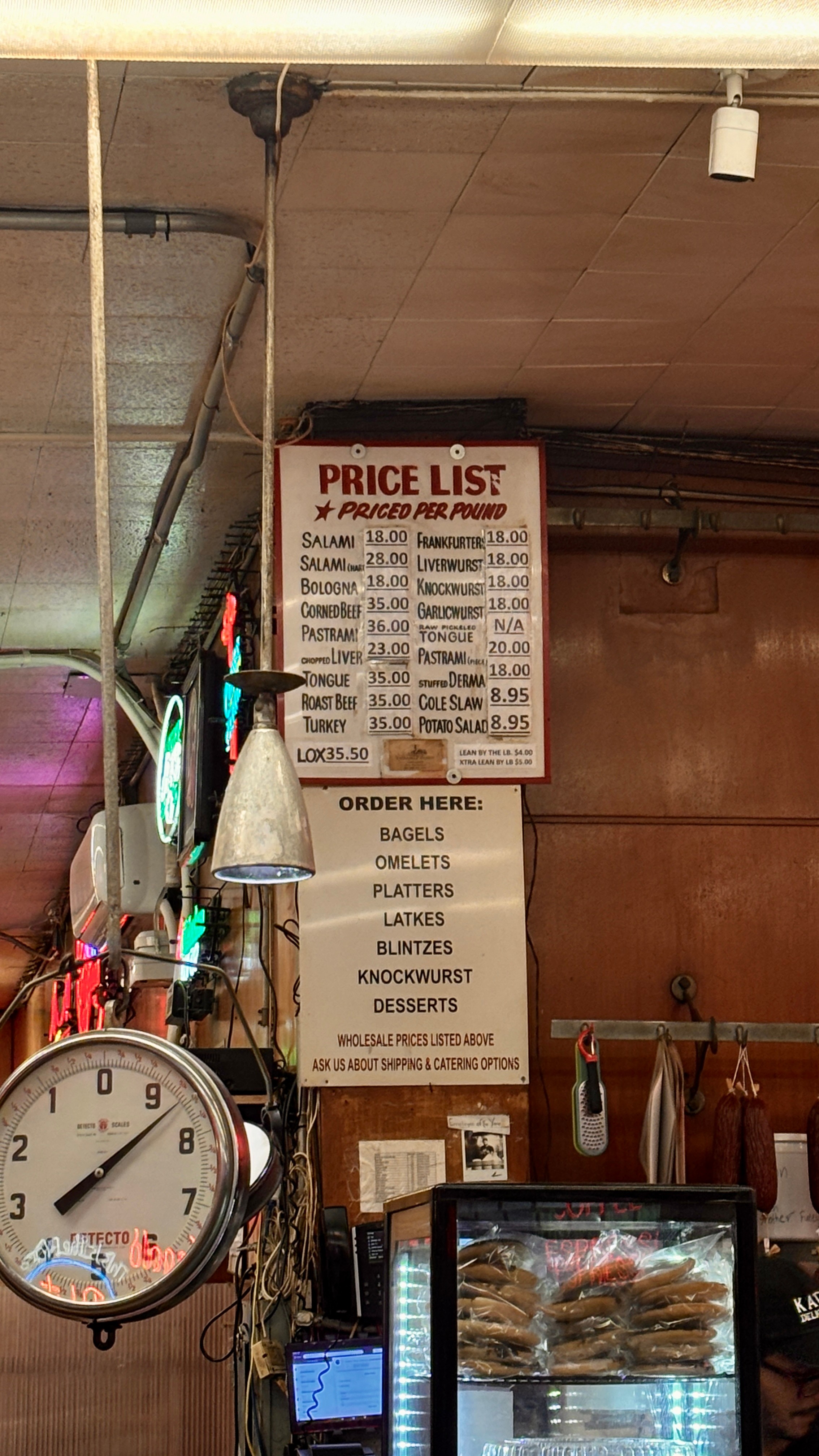
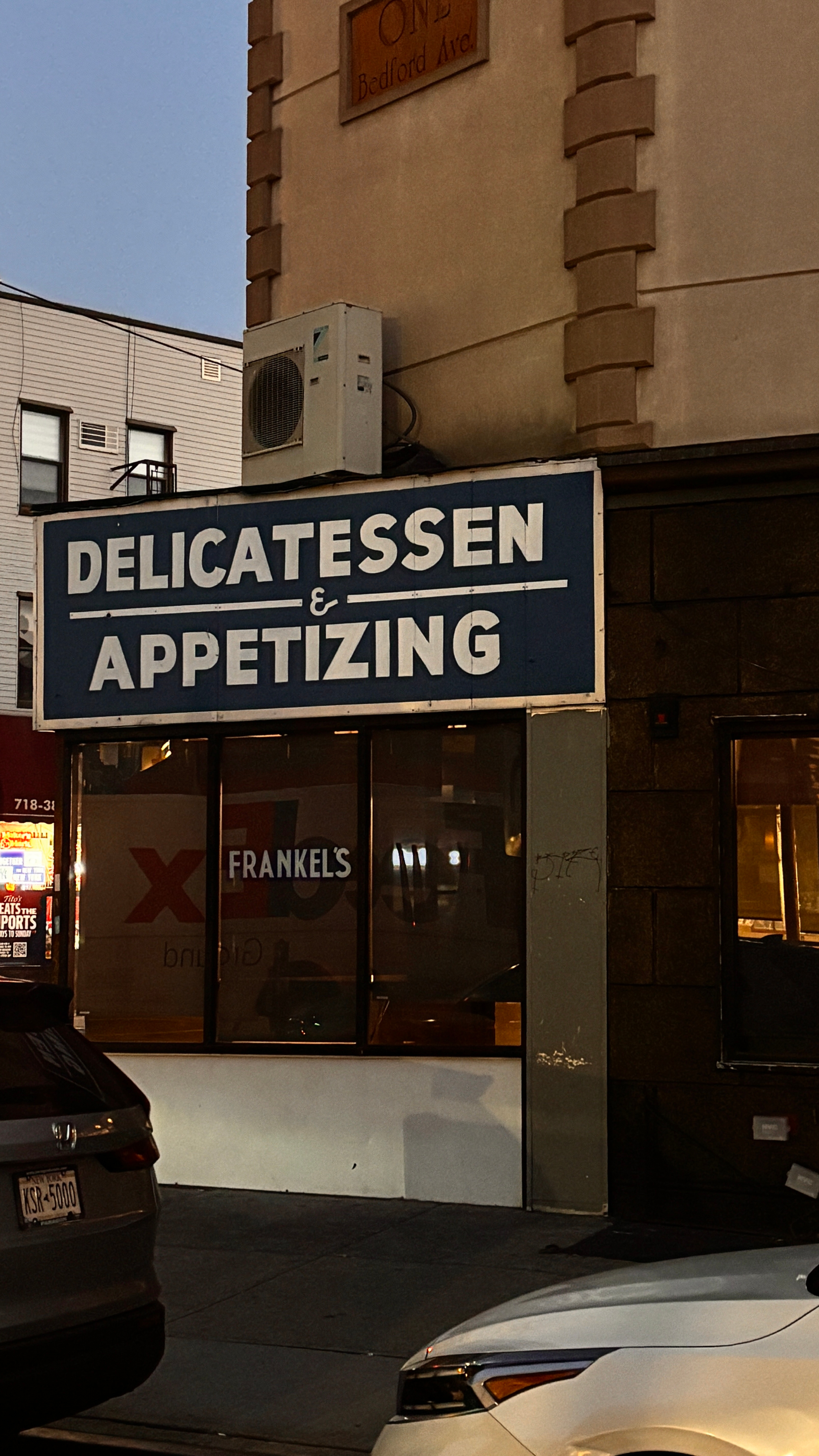
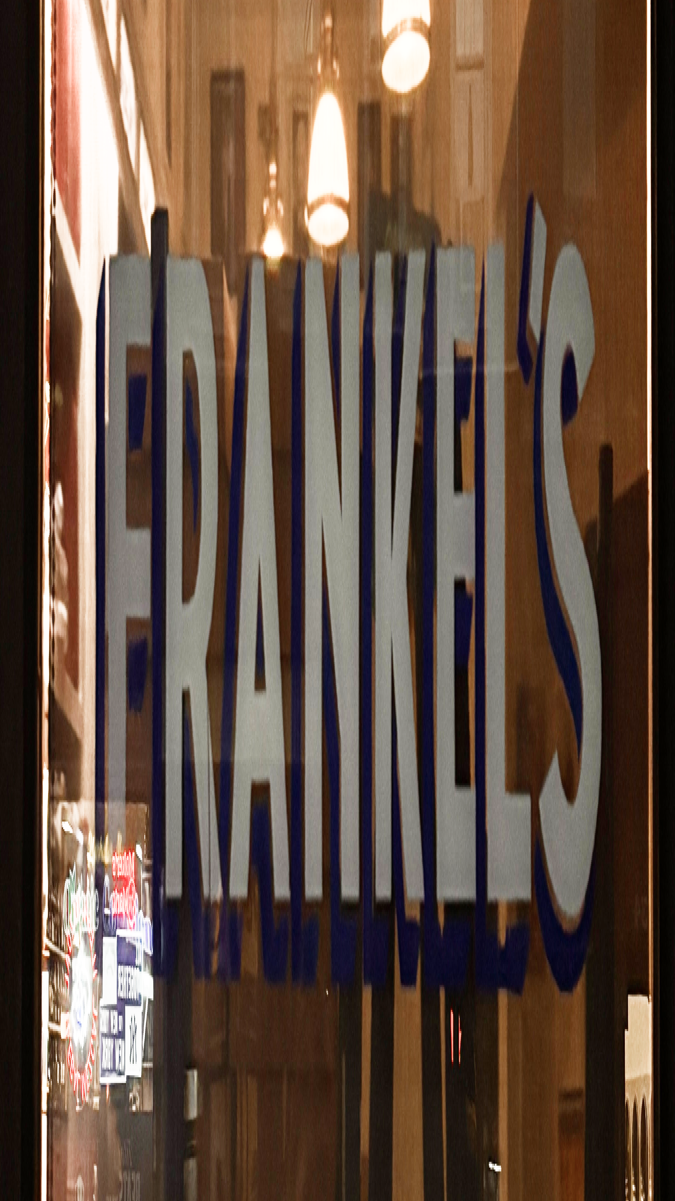
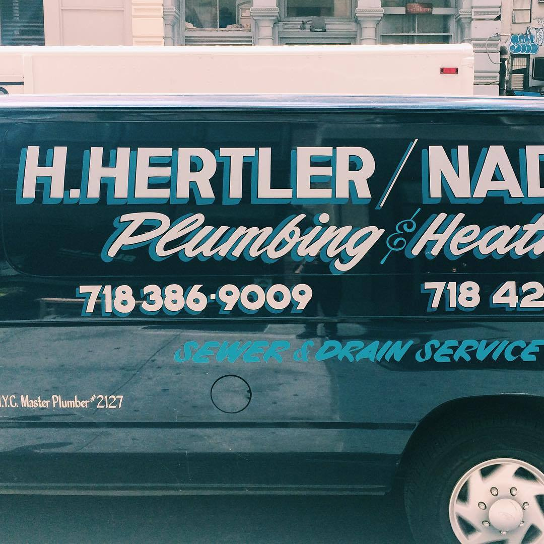
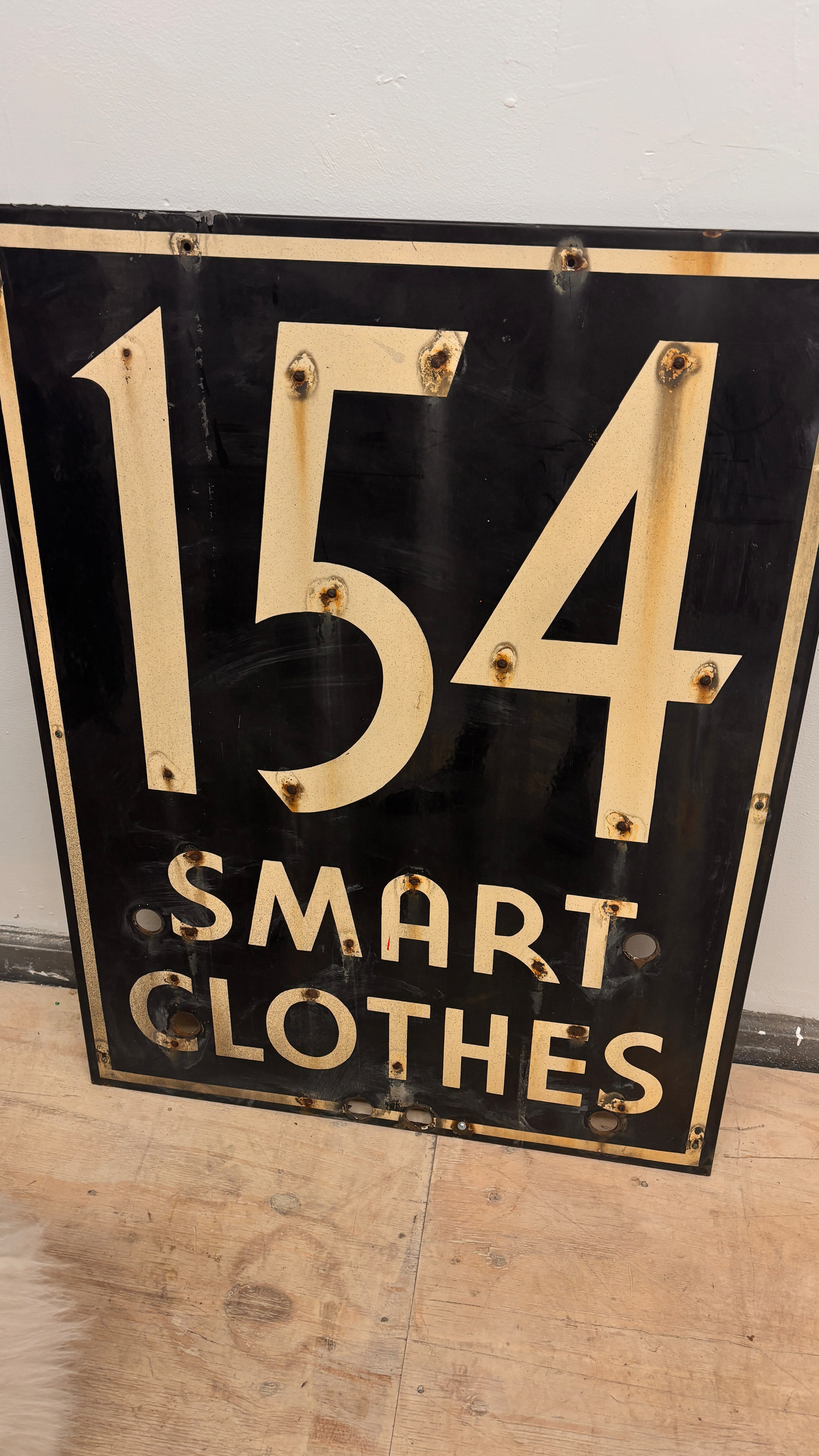
Greenpoint Sans is a condensed sans serif inspired by the storefronts and brick façades of Greenpoint neighborhood. Blending utilitarian grit with the eclectic spirit of local signage, it features tight proportions, raw geometry, and a confident rhythm — a distilled interpretation of Brooklyn’s vernacular typography.
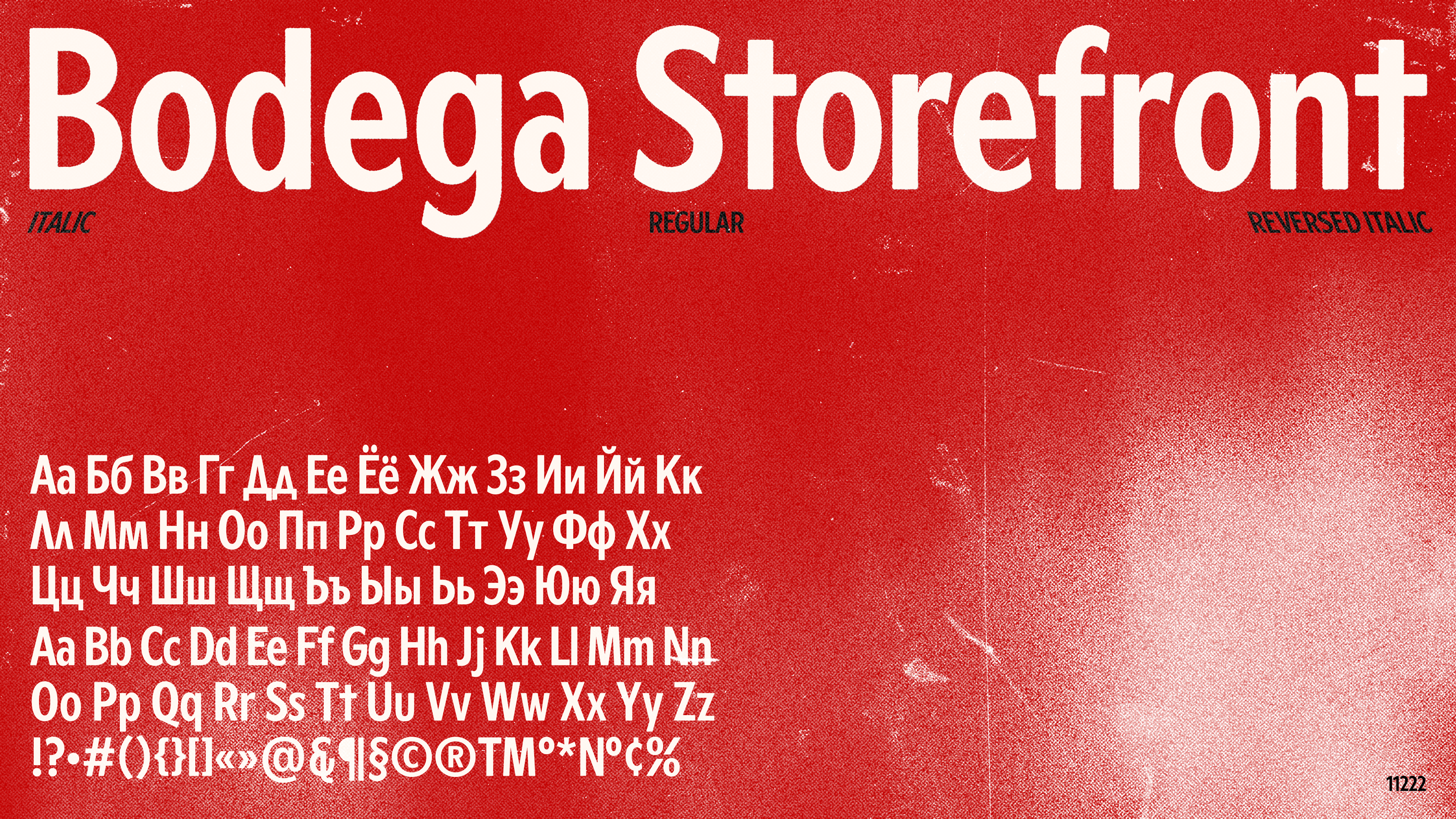
It started with collecting signage around the neighborhood, and slowly turned into a typeface. Greenpoint Sans translates these references into a condensed digital form, with a variable slant axis — both italic and reverse — reflecting how type appears across local storefronts. Available in Latin and Cyrillic, it’s a self-initiated project, free for both personal and commercial use.
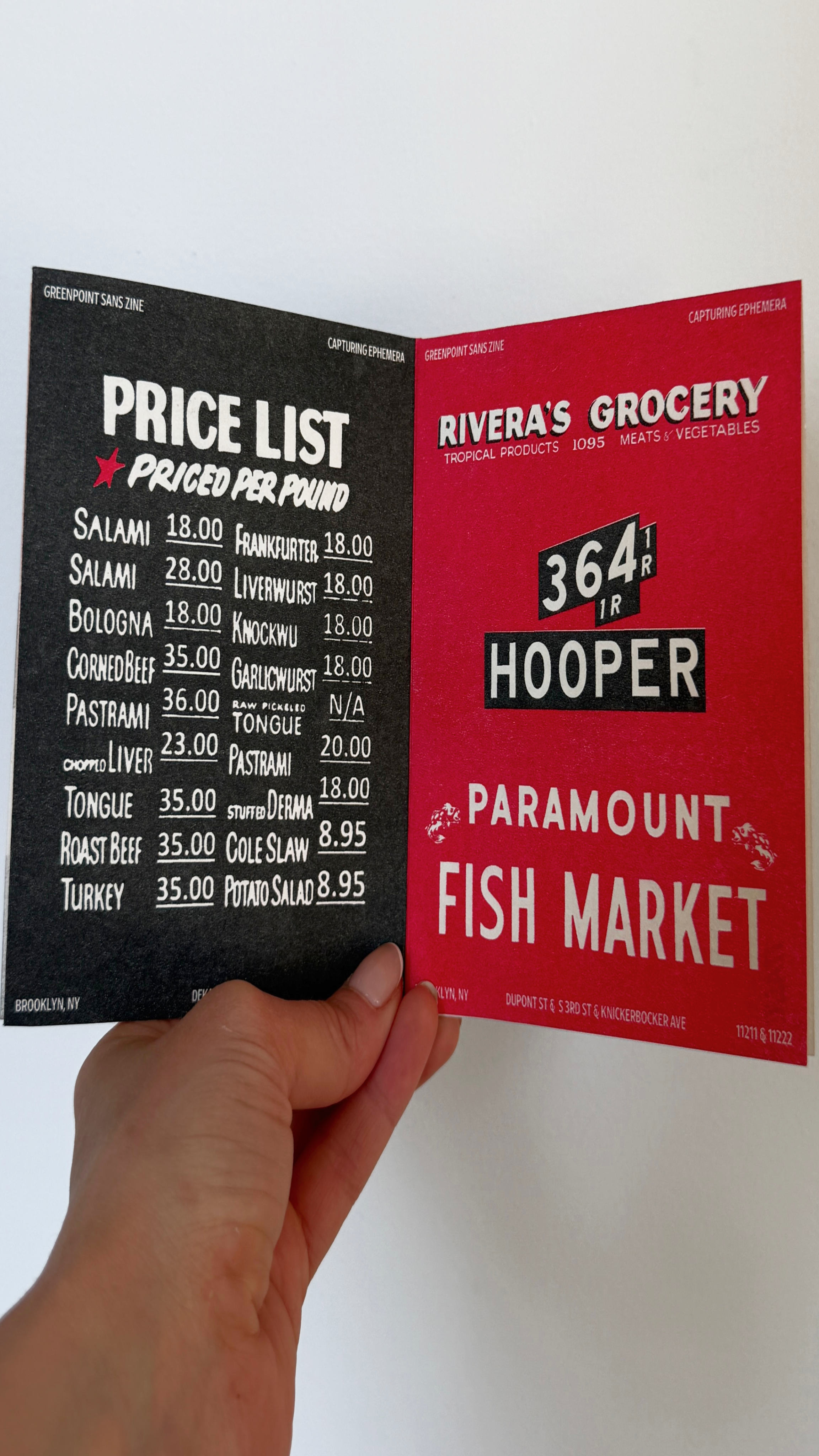
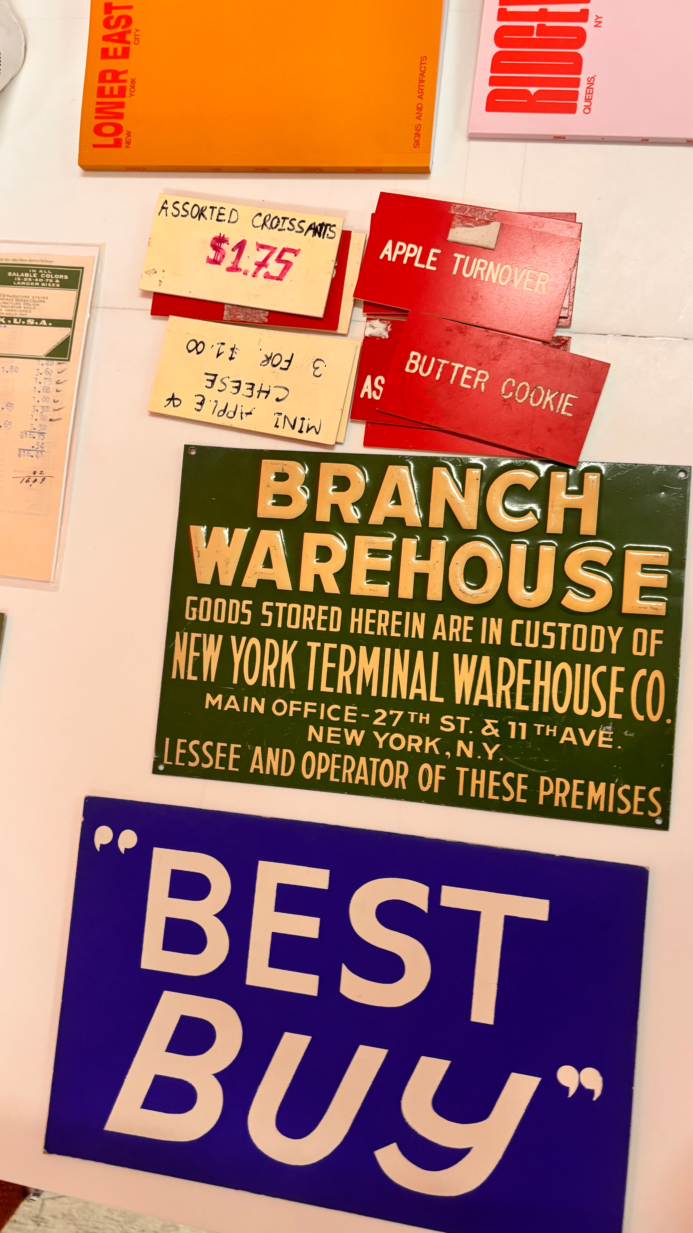
Alongside the typeface, I created a zine documenting the ephemera behind the project. Printed on a risograph, it echoes the same transient, tactile quality of the source material.

Other Projects


Reach out — let’s make it happen.


+1 (929) 292 06 10
sashadenisova.xyz@gmail.com


Study of Vernacular
Greenpoint Sans is a condensed sans serif inspired by the storefronts and brick façades of Greenpoint neighborhood. Blending utilitarian grit with the eclectic spirit of local signage, it features tight proportions, raw geometry, and a confident rhythm — a distilled interpretation of Brooklyn’s vernacular typography.
It started with collecting signage around the neighborhood, and slowly turned into a typeface. Greenpoint Sans translates these references into a condensed digital form, with a variable slant axis — both italic and reverse — reflecting how type appears across local storefronts. Available in Latin and Cyrillic, it’s a self-initiated project, free for both personal and commercial use.
Alongside the typeface, I created a zine documenting the ephemera behind the project. Printed on a risograph, it echoes the same transient, tactile quality of the source material.

Other Projects

Reach out — let’s make it happen.

+1 (929) 292 06 10
sashadenisova.xyz@gmail.com

Study of Vernacular
Greenpoint Sans is a condensed sans serif inspired by the storefronts and brick façades of Greenpoint neighborhood. Blending utilitarian grit with the eclectic spirit of local signage, it features tight proportions, raw geometry, and a confident rhythm — a distilled interpretation of Brooklyn’s vernacular typography.
It started with collecting signage around the neighborhood, and slowly turned into a typeface. Greenpoint Sans translates these references into a condensed digital form, with a variable slant axis — both italic and reverse — reflecting how type appears across local storefronts. Available in Latin and Cyrillic, it’s a self-initiated project, free for both personal and commercial use.
Alongside the typeface, I created a zine documenting the ephemera behind the project. Printed on a risograph, it echoes the same transient, tactile quality of the source material.

Other Projects

Reach out — let’s make it happen.


+1 (929) 292 06 10
sashadenisova.xyz@gmail.com
